Here we want to take you through the anatomy of creating a visual brand identity. Warts and all. To explore the process and how each identity element informs the next.
Sowers Sustainable farms
Josh & Tricia Sowers came to Graphic Granola to create a brand identity for a sustainable farm in Coupland, Texas, which restores biodiversity and natural balance. They hope these efforts will result in the expansion of awareness and the formation of a community that will further propagate sustainable practices. The Sowers wanted to highlight that everything is connected – there is nothing that exists in isolation. Their first priority is the ecosystem that they are promoting, which will feed their family and community. Their second priority is the quality of products that result from these efforts. Their third priority is building a network for selling these products, which will help to propagate and enhance their first and second priorities.
Initially, we started the process with a brand questionnaire, which explores their goals, the market, ideal client/customer, pain points, personality, competition, differentiation, their compelling brand story, and their audience’s common language. With that information, Graphic Granola researched the internet to see what other farms in their space are doing with their branding. Then we met in person to work out any questions we have, to get a better feel for the brand they’re creating. For our first meeting, I brought my friend, Ruth Glendinning, who is very active in sustainable practices and communities. We all hit it off instantly and became fast friends.

logo design process
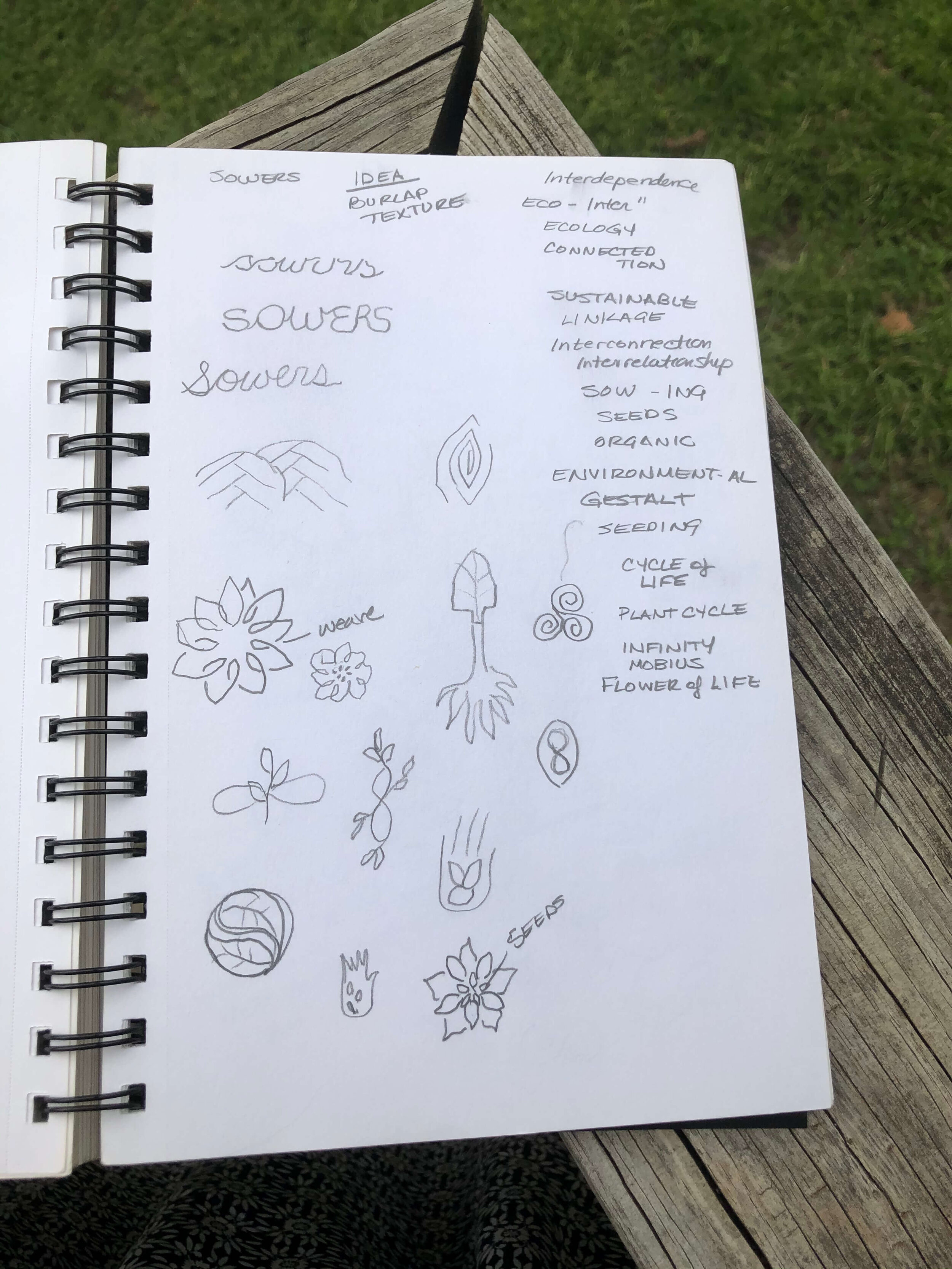
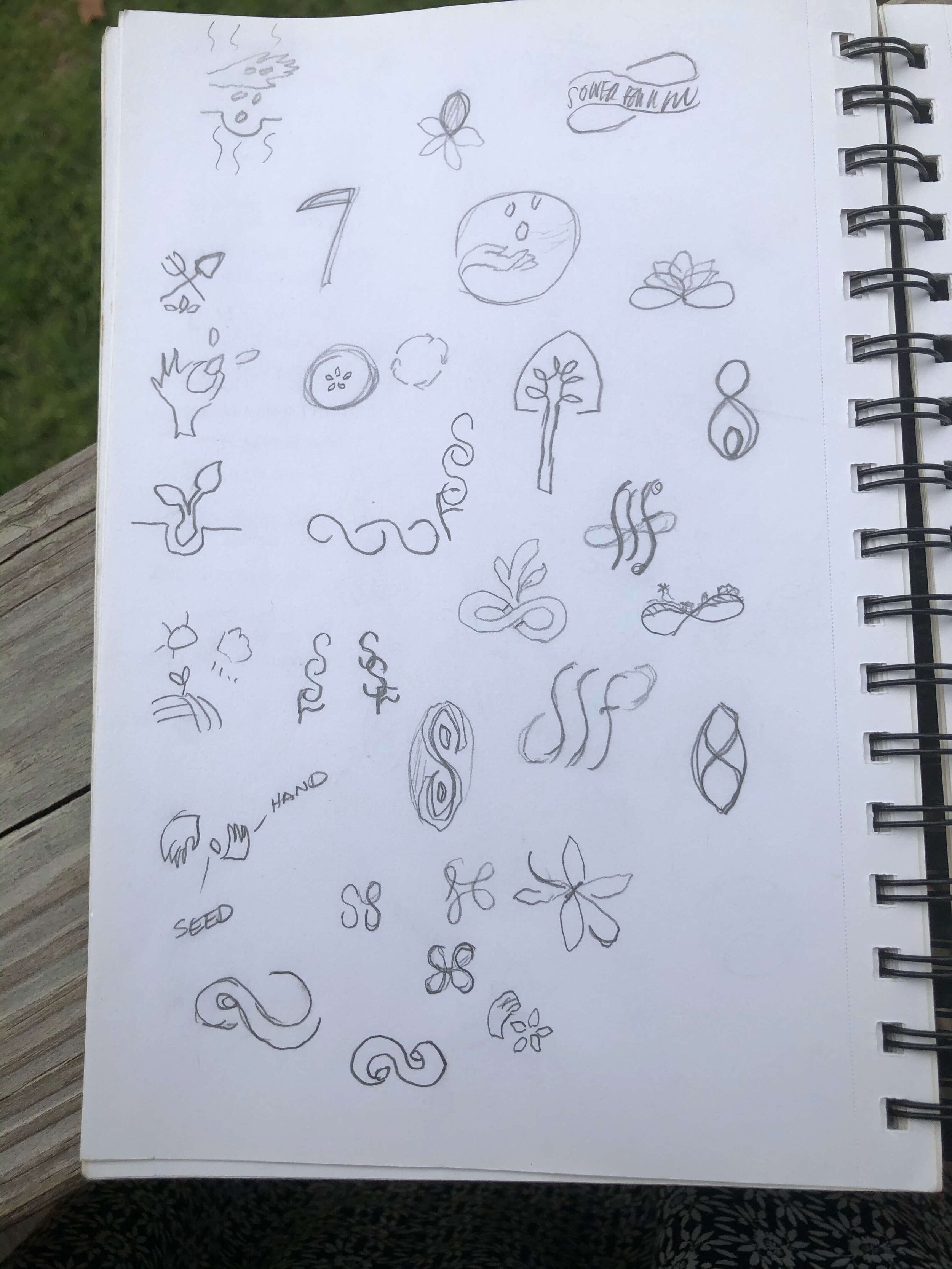
Next step, we start working with thumbnail sketches. Mine are pretty rough (and I’m just showing a few). Thumbnail sketches are quick, rough conceptual sketches that allow me to get as many potential solutions down on paper as quickly as possible. Quick ideas put down on paper. I work with lots of lists since I’m a word person. Brainstorming on what kinds of imagery will convey what we want to communicate.
Once I have some solid ideas down on paper, I take them to Adobe Illustrator and start creating the digital design elements which will become the iconic symbols for the logo. Playing with typefaces and different visual motifs. I usually don’t initiate color until the next round of revisions, but the Sowers knew they wanted to work with a green and blue color scheme, so I incorporated that scheme into the initial logo designs.
If I were designing these logo designs along with other designers, we would meet and go through a critique. Pinning the logos up on a board for all to review and then the group debates the merits or faults of each logo design and discusses how to make the leading designs more effective. It’s helpful to have a hive of creative minds working together.
I also created a custom evaluation sheet for the Sowers to systematically evaluate each design to ensure the logo designs are effectively communicating their brand personality and visually describing what they do. Offering a more systematic and informed evaluation approach, rather than a purely emotional one.
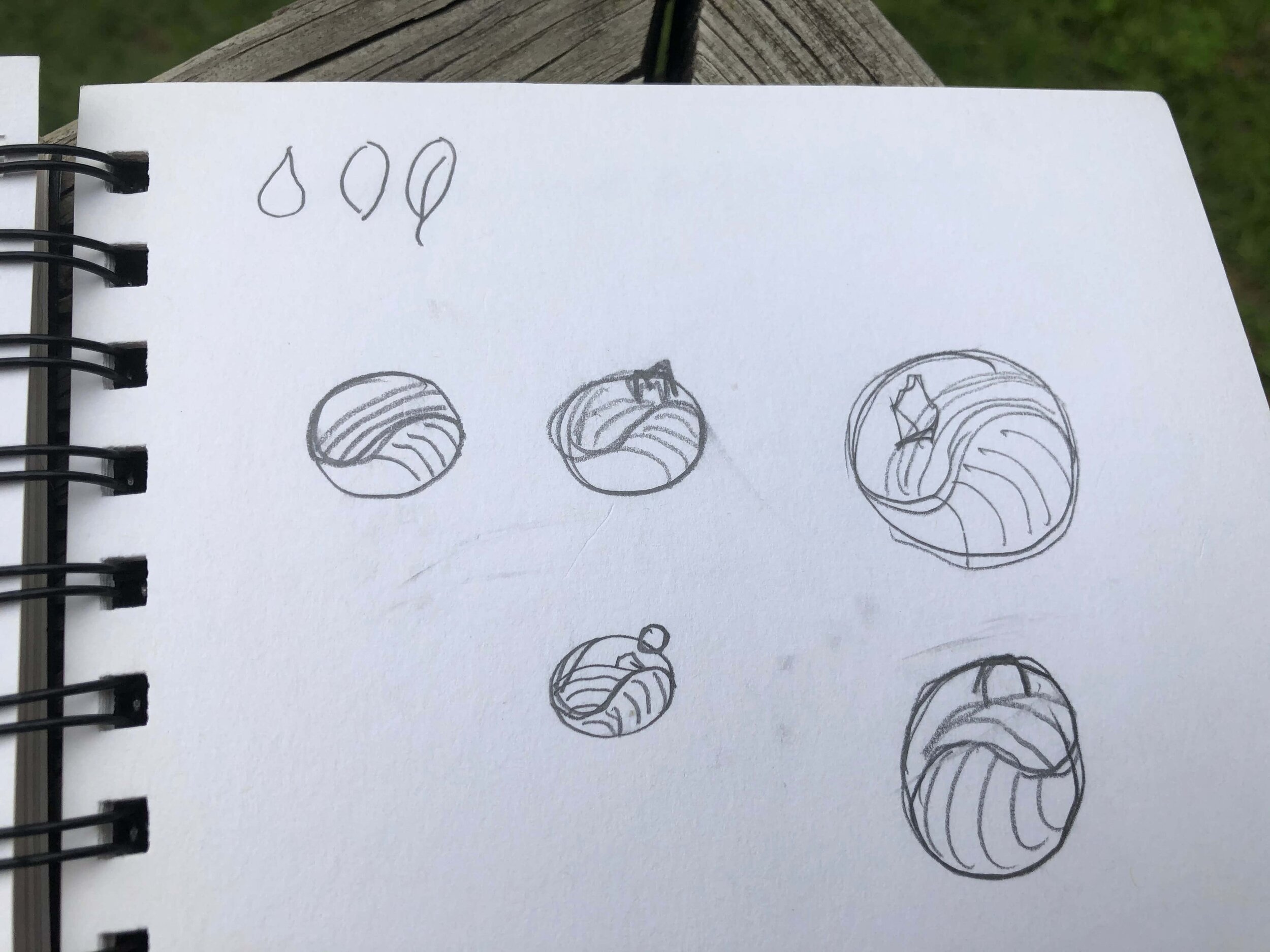
Once we have three to five solid directions, I digitally work up each individual logo in Adobe Illustrator. Generally, I’ll design three to five different design directions. However, sometimes I’m particularly inspired and have a natural affinity for my Client’s mission. Such is the case with Sowers Sustainable Farms. I really went overboard with ten logo design options to consider. I was inspired not only by their mission, and what wonderful people Josh and Tricia Sowers are, but because their name is so great! To become farmers when your last name is SOWERS, well, it’s just fate.
Loved the idea that, as farmers, they are working with their hands. Shaping their land. And how that hand image can visually become the land. Also, the sustainable nature of their enterprise was inspirational. How everything is connected in nature. Gestalt, as in the whole, working together, is worth more than the sum of its parts. If you think about it, sustainable farming is conceptually spiritual, which led me to explore the infinity symbol, sacred geometry, and the yin/yang symbol.
The Sowers chose a couple of design directions to explore and we edited, tweaked, and revised until we had developed the final logo design.
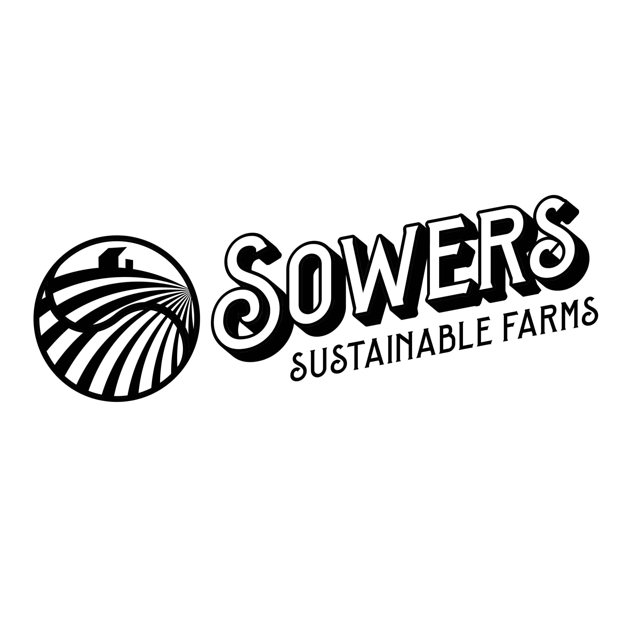
THE SOWERS SUSTAINABLE LOGO

A Branding Board, also called a Mood Board, starts to define the visual elements of the brand. Taking cues from the logo, I start to extrapolate what elements would work within the visual branding.
Color palettes are explored with color theory in mind, evoking the emotions we’d like the brand to convey. Here I utilized a color palette that is bright, colorful, and youthful. I also wanted to explore colors tied to natural elements like land, sky, harvest (maize), dirt/wood, along with a startlingly bright color (coral) and a neutral color (graphite). Colors vibrant enough to really pop next to each other. Iconography, textures and background patterns, design elements, and photography.
With the fonts, the Sowers had mentioned that they wanted to harken back to the days of the old-fashioned general store. Which is how we settled on the logo typeface. I combined this retro type in juxtaposition with more modern and clean typefaces. Plus I included a script typeface for emphasis and personal messages.
The iconography is flat and graphic, with a nod to the logo yin/yang farm symbol. Also to incorporate that modern aesthetic. Very basic representations of farm elements: bee, barn, fruit, vegetables, etc. Fun, simple, hand-drawn framing devices used to give it a whimsical yet homespun personality.
With patterns and backgrounds, I explored topographic map textures along with rough textures you might find on a farm, such as wood grain or eroded metal. The roughness against the clean lines of the iconography and typefaces marries the old with the new. Old-school farming working with the new sustainable sensibility.
With the design elements, I followed the same trajectory of mixing vintage engraved or worn imagery with the more modern, clean design elements. Same hand-drawn borders to be incorporated for a touch of whimsy.
For photography, I opted for wide, expansive visuals. Emotive of the vast Texas countryside. Or utilizing grayscale images with a spot of color for visual focus.
Brand boards can be instrumental in guiding the visual development of a brand. Of course, since the brand will be ever-evolving, it’s good to keep the rules somewhat flexible. And to revisit the branding board every so often to apply updates as the brand continues to grow.
SUB-BRAND
As the Sowers began exploring all that they are creating with their farm products, they realize a need for a sub-brand.
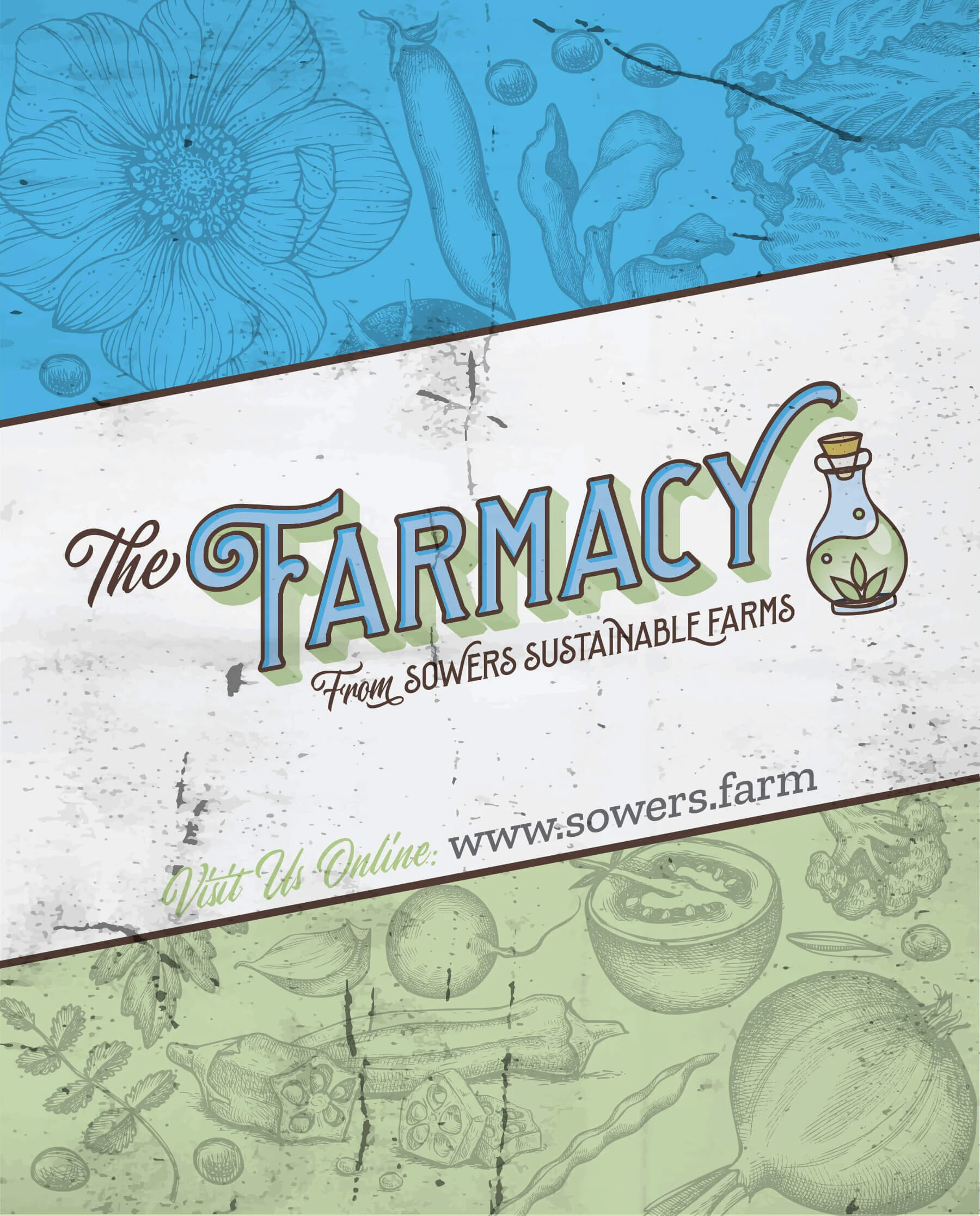
The Farmacy brand is designed for foods, lotions, and anything which would fall under healthy living. It's everything that we feed our body (milk products included) and use to augment our experience here.
Categories include:
Seeds, leaves, and blends (garden produce, starter plants, seeds, teas, and medicinals - including lotions, dried herbs)
Dairy (butter, cheese, raw milk, buttermilk, cream)
Meat (in limited quantities)
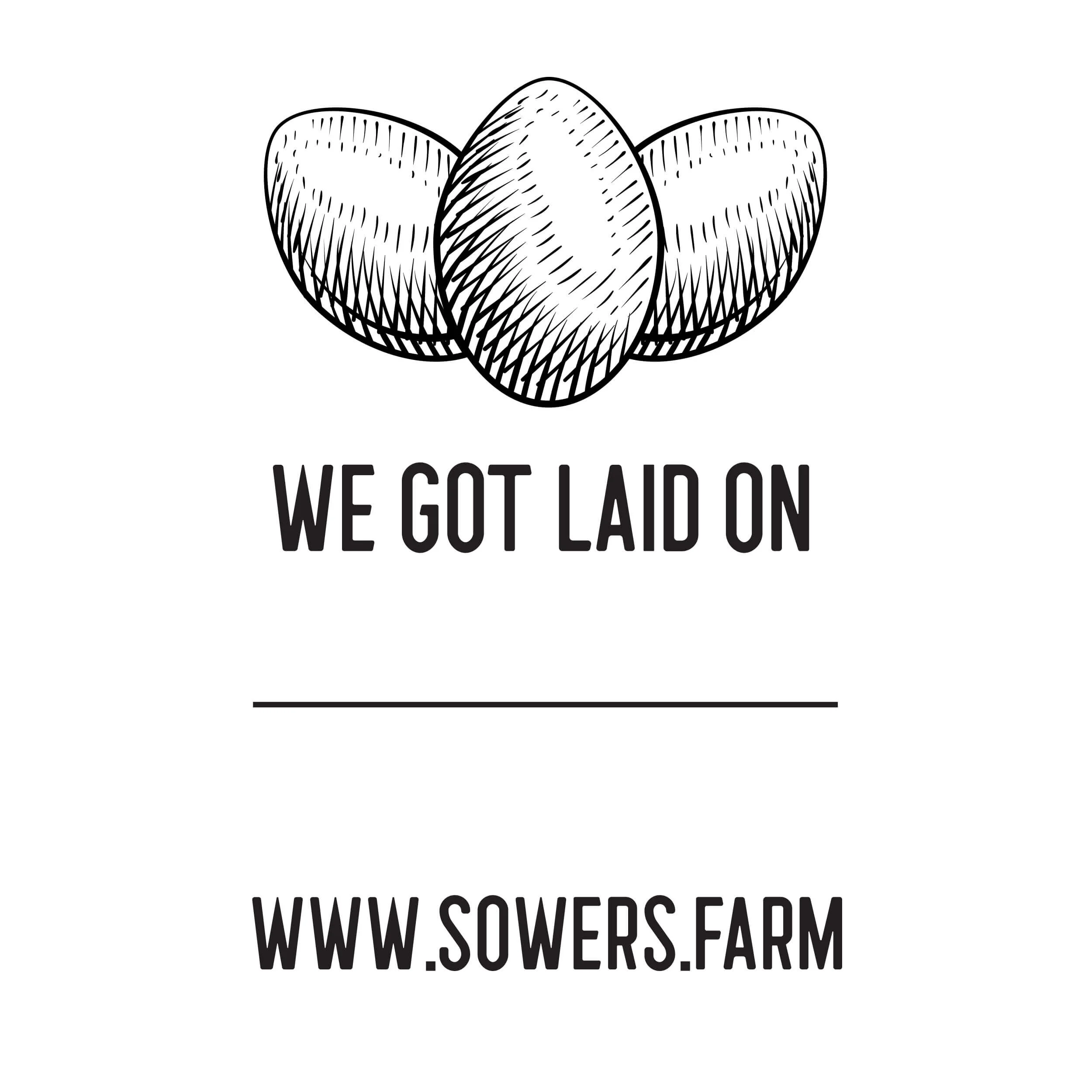
Eggs (duck, chicken)
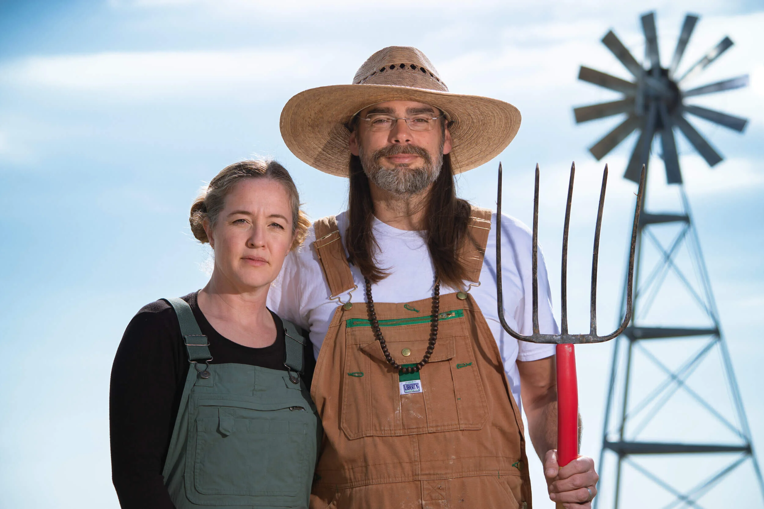
Josh and Tricia Sowers, modern sustainable farmers.
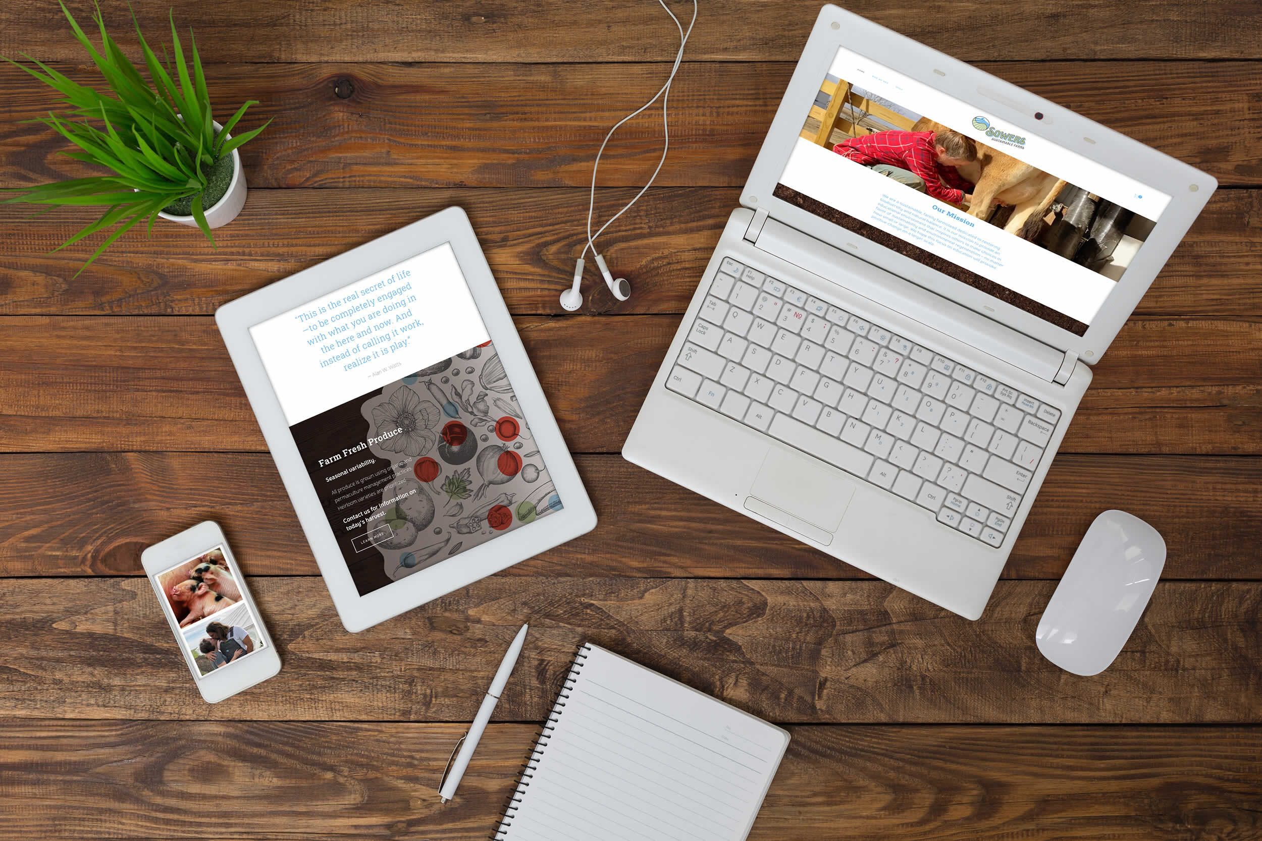
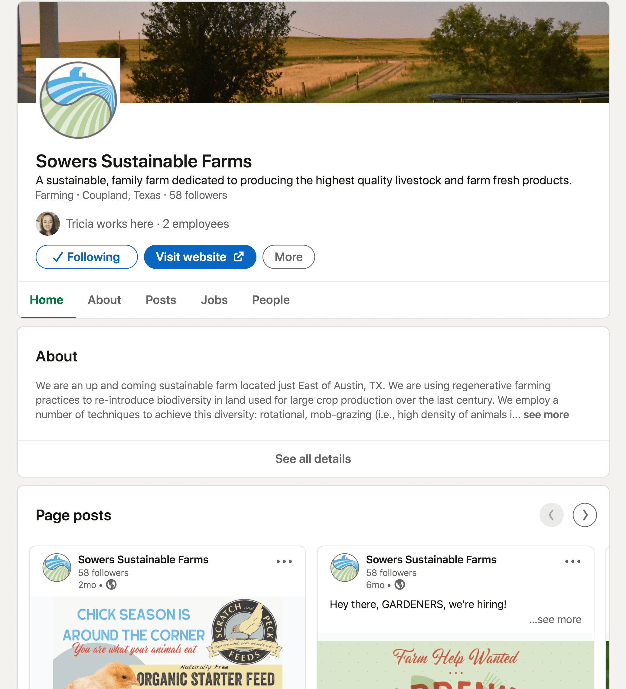
Sowers Sustainable Farms: Responsive Design
website
Sowers Sustainable Farms is creating and maintaining a sustainable farm, which restores biodiversity and natural balance. We hope these efforts will result in the expansion of awareness and the formation of a community that will further propagate sustainable practices.
Our favorite clients, the Sowers, have become fast friends. Love to spend a day out on the farm. We initiated their branding with a logo, a sister logo for "The Farmacy,” along with signage, social media graphics, help wanted ads, and this responsive website design. We utilized Squarespace plug & play for their one-page website development. That way they can grow the site as their farm itself grows. This website features an e-commerce, online shopping cart that the Sowers can utilize as more products are developed. Coming soon, a traveling farmer’s market by way of an adapted school bus.
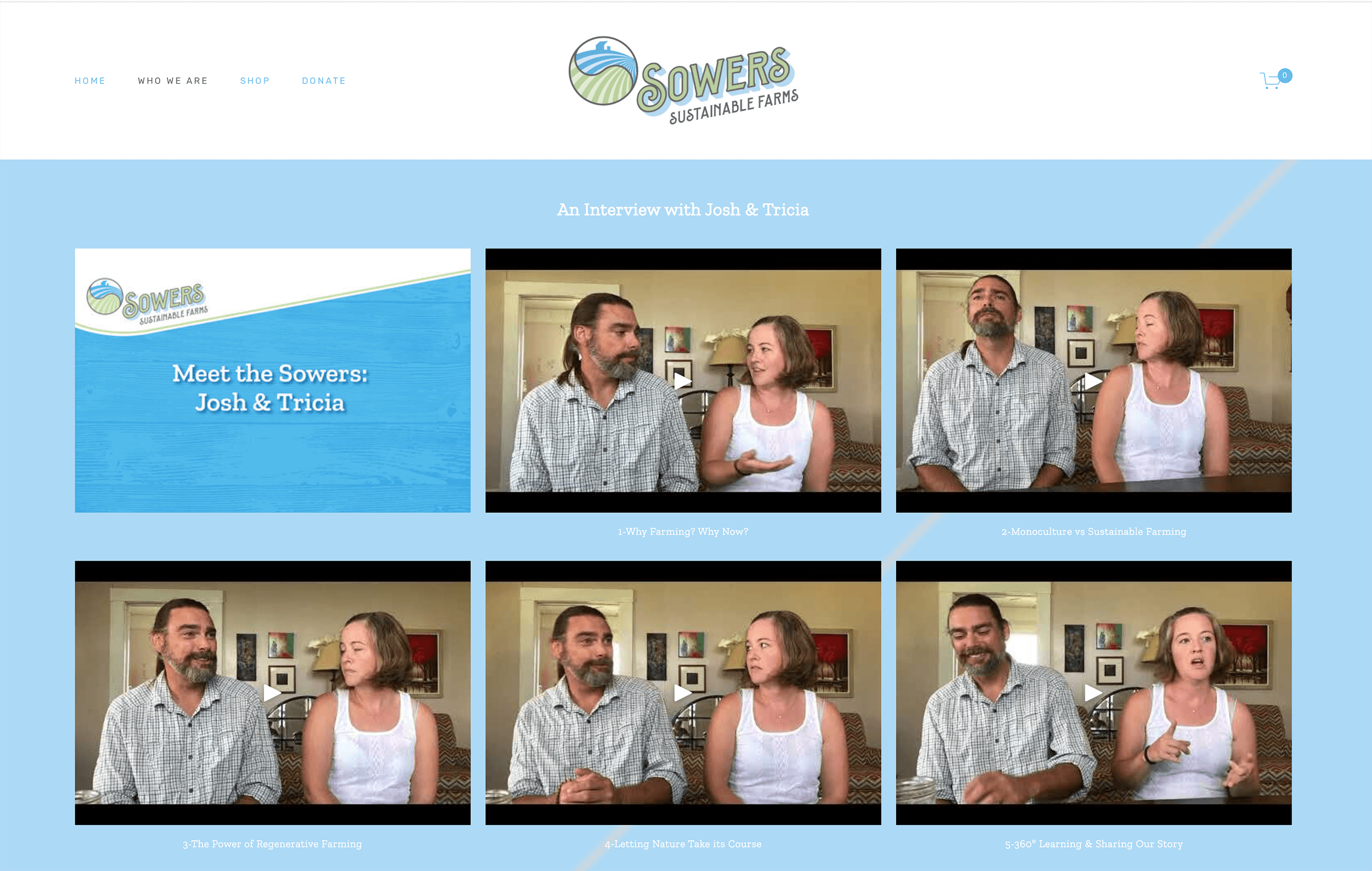
One fun aspect of the Sowers Sustainable Farms website is their back story. We videotaped an interview with the Sowers on my iPhone. I was able to edit the video clips together and add title slides via YouTube.
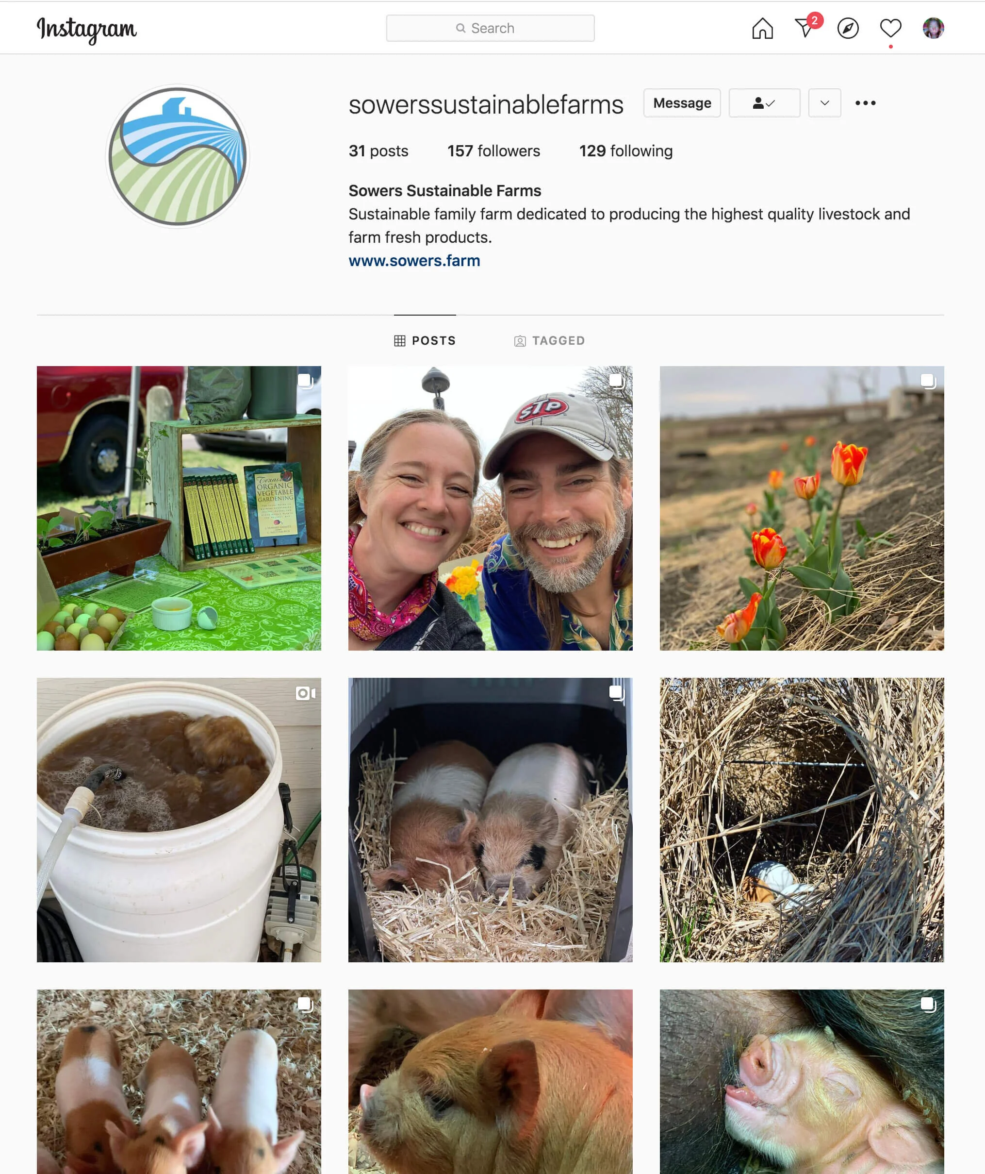
social media
Social media accounts were set up for Facebook, Instagram, LinkedIn, and the Sowers have their very own YouTube channel to feature their back story and farm videos.
Future videos will be shot to educate about sustainable farming practices.

brand collateral
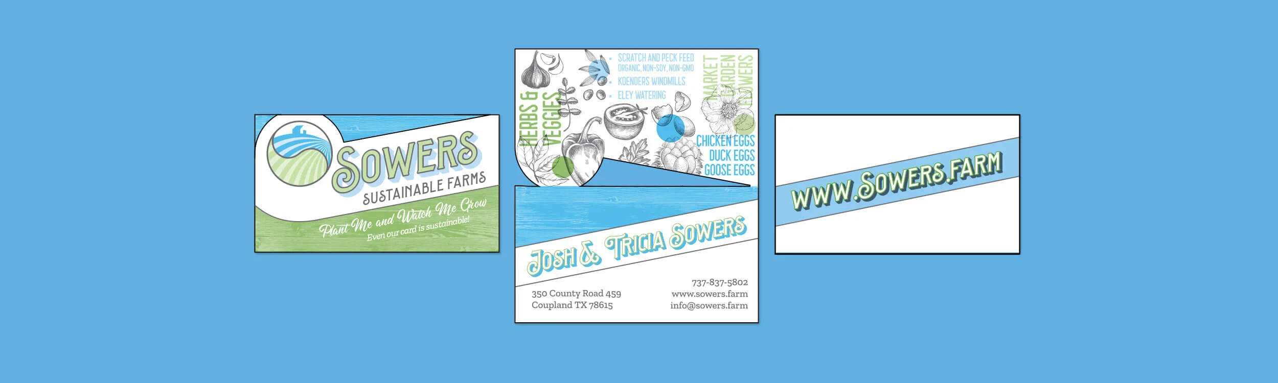
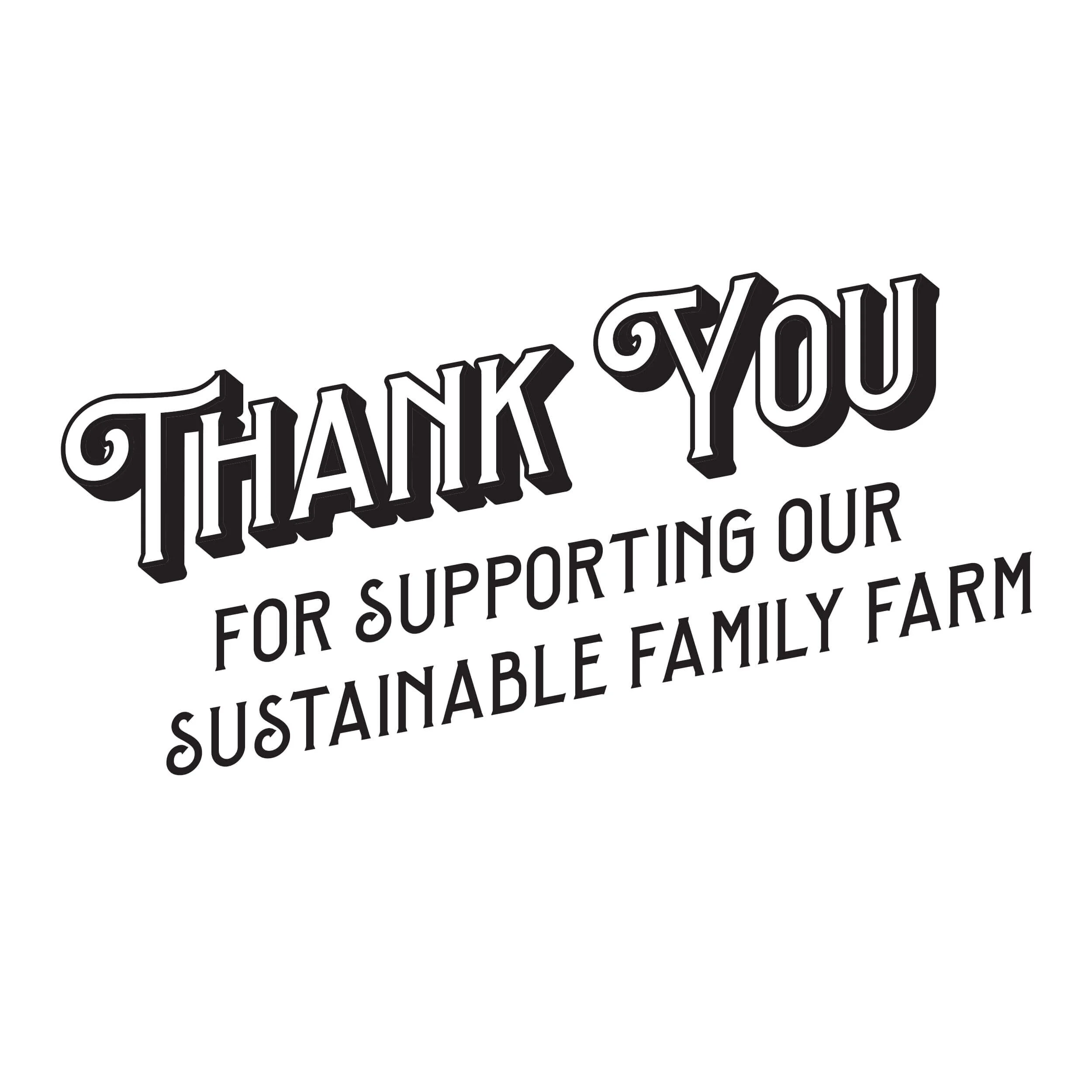
Next step in our branding process, we designed the Sowers’ printed brand collateral.
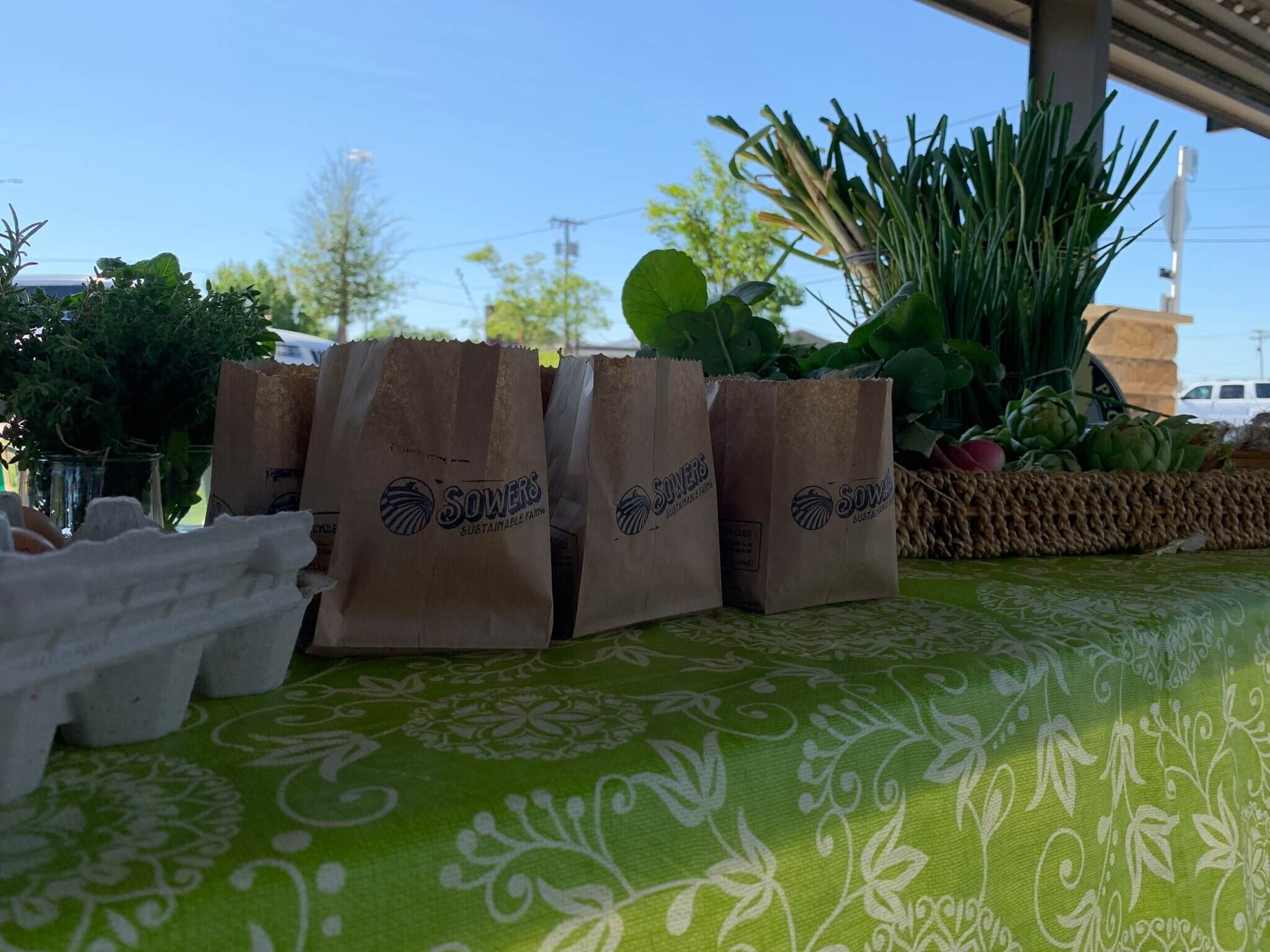
Business cards were needed since Josh & Tricia would be networking to build relationships and better serve their community. Tricia had the brilliant idea to print the business cards on seeded paper, so the cards could actually be planted and bloom into flowers. I created a die-cut, folded card to feature all that they will be offering on the farm.
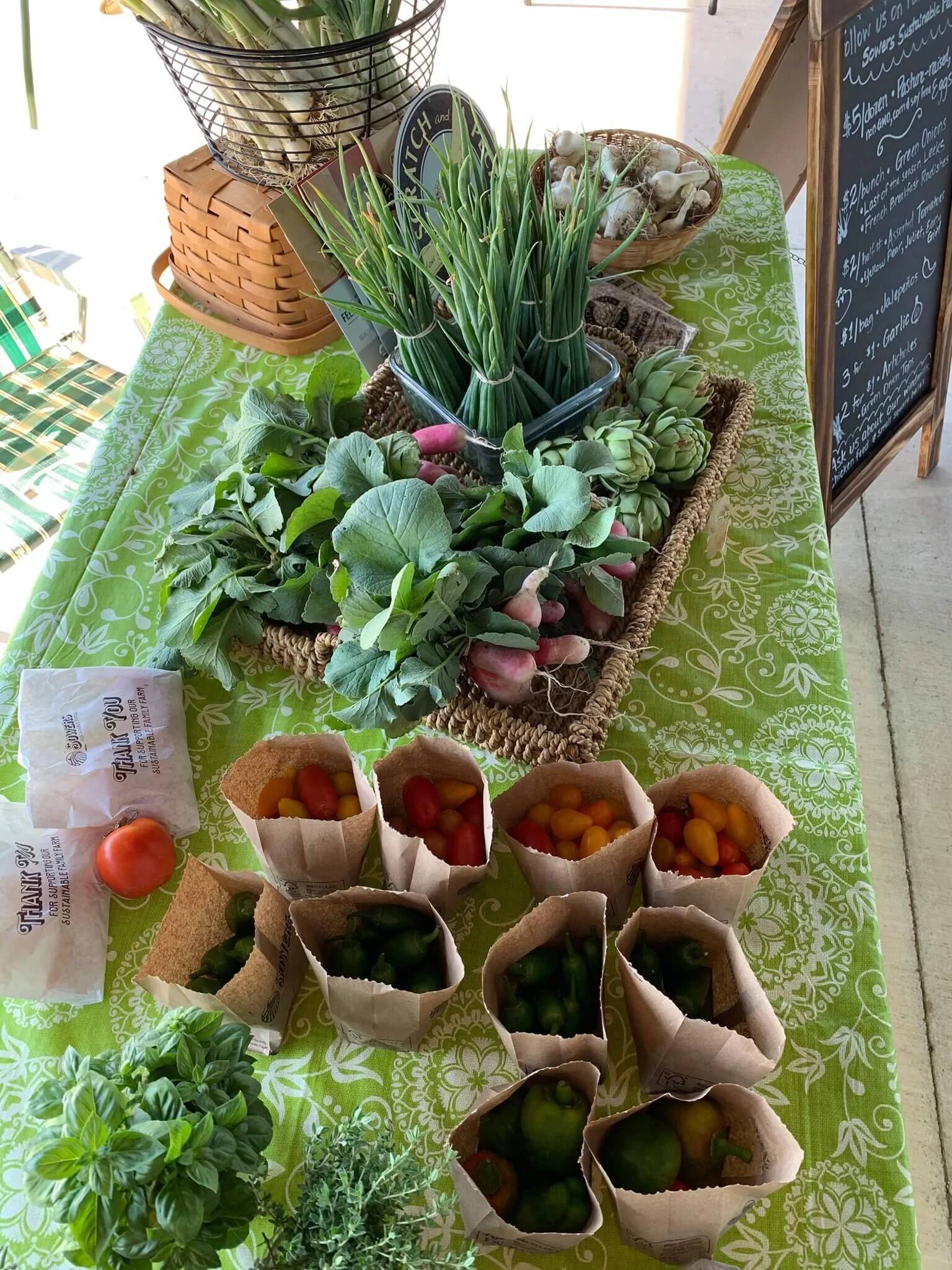
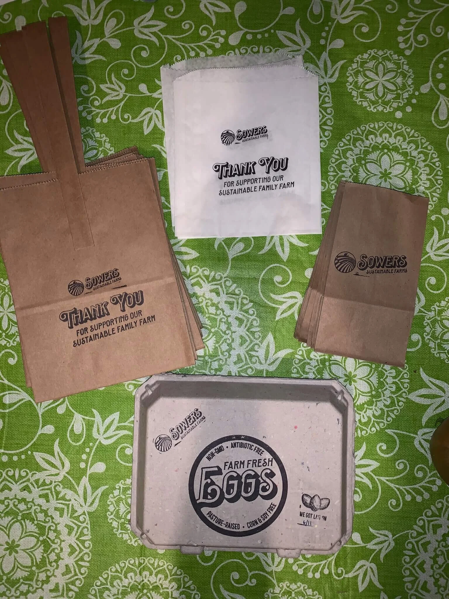
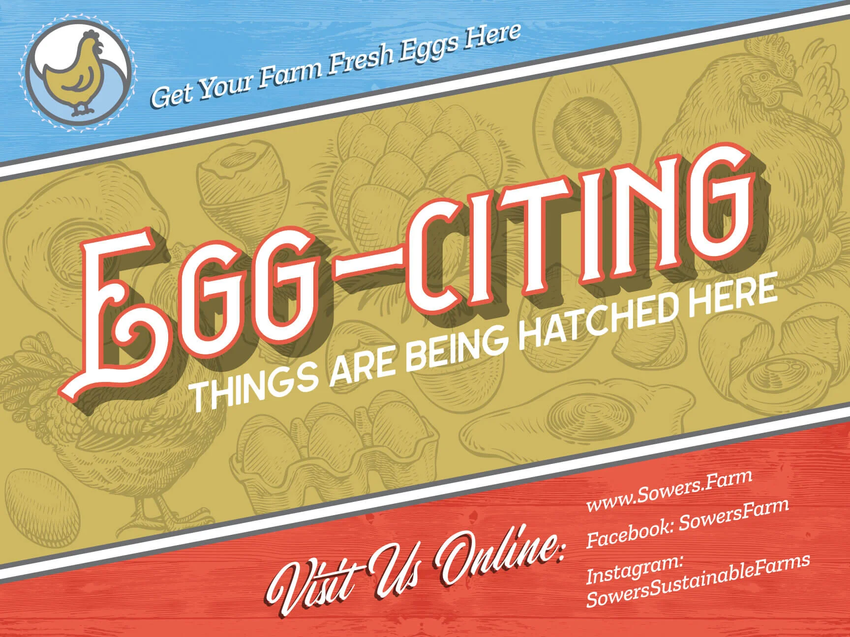
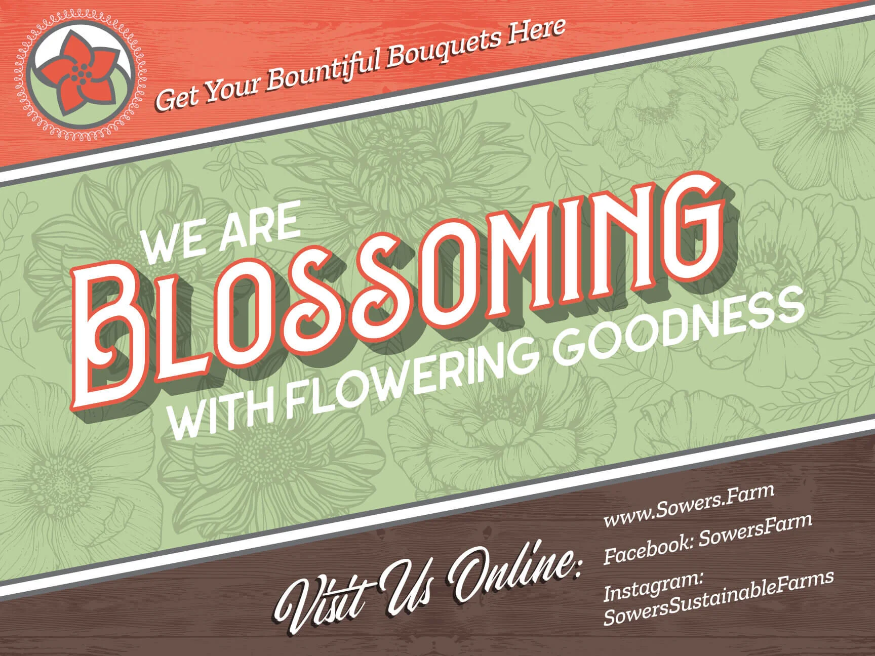
Since they will be selling their wares at farmer’s markets, they needed custom-designed packaging for veggies, herbs, and farm-fresh eggs. We opted for a flexible and affordable solution of rubber stamps on biodegradable packaging.
We also designed a farmer’s market sign to help them build their brand. Ultimately, they will utilize their tiny store bus for a rolling farmer’s market all their own.


brand signage
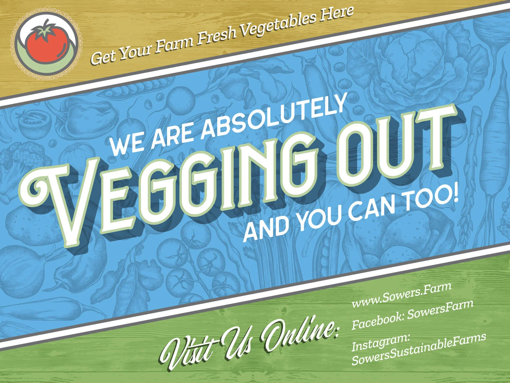
Since they have a lot of foot and bicycle traffic right by the farm, the Sowers wanted signs designed for the farm’s outside fence. To visually advertise to passerby folks all that the Sowers Sustainable Farm has to offer.
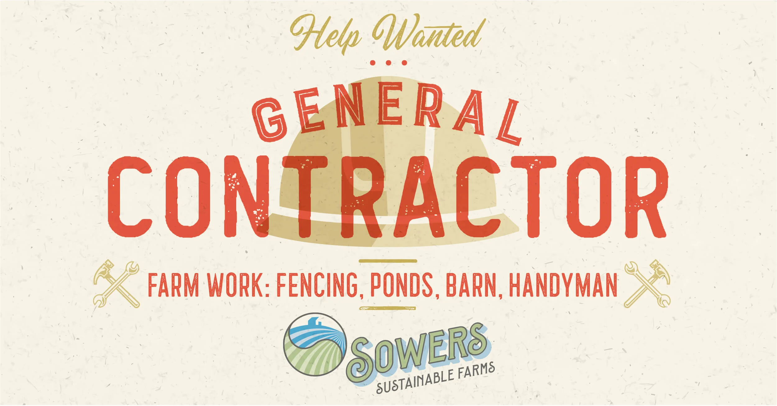
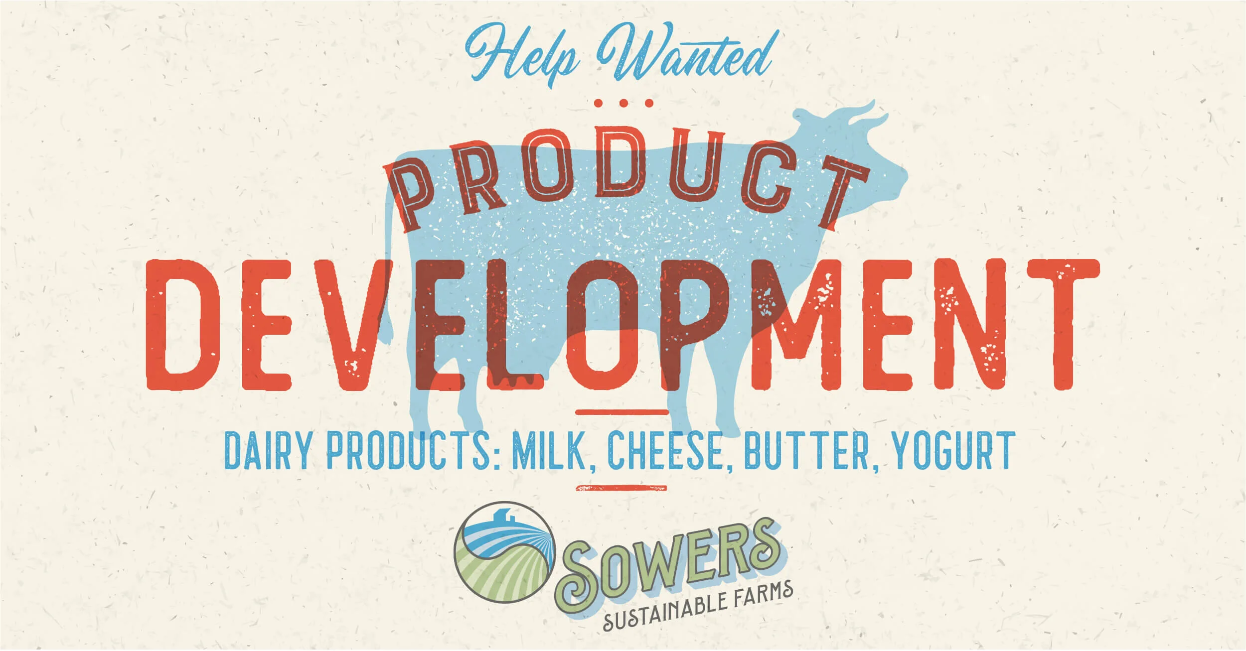
As they grow, the Sowers realize they need more help on the farm. So I created some branded graphics for their social media channels. We also posted these help-wanted signs on farm-focused job boards.
Simple directional signage is designed for way-finding outside of the farm.
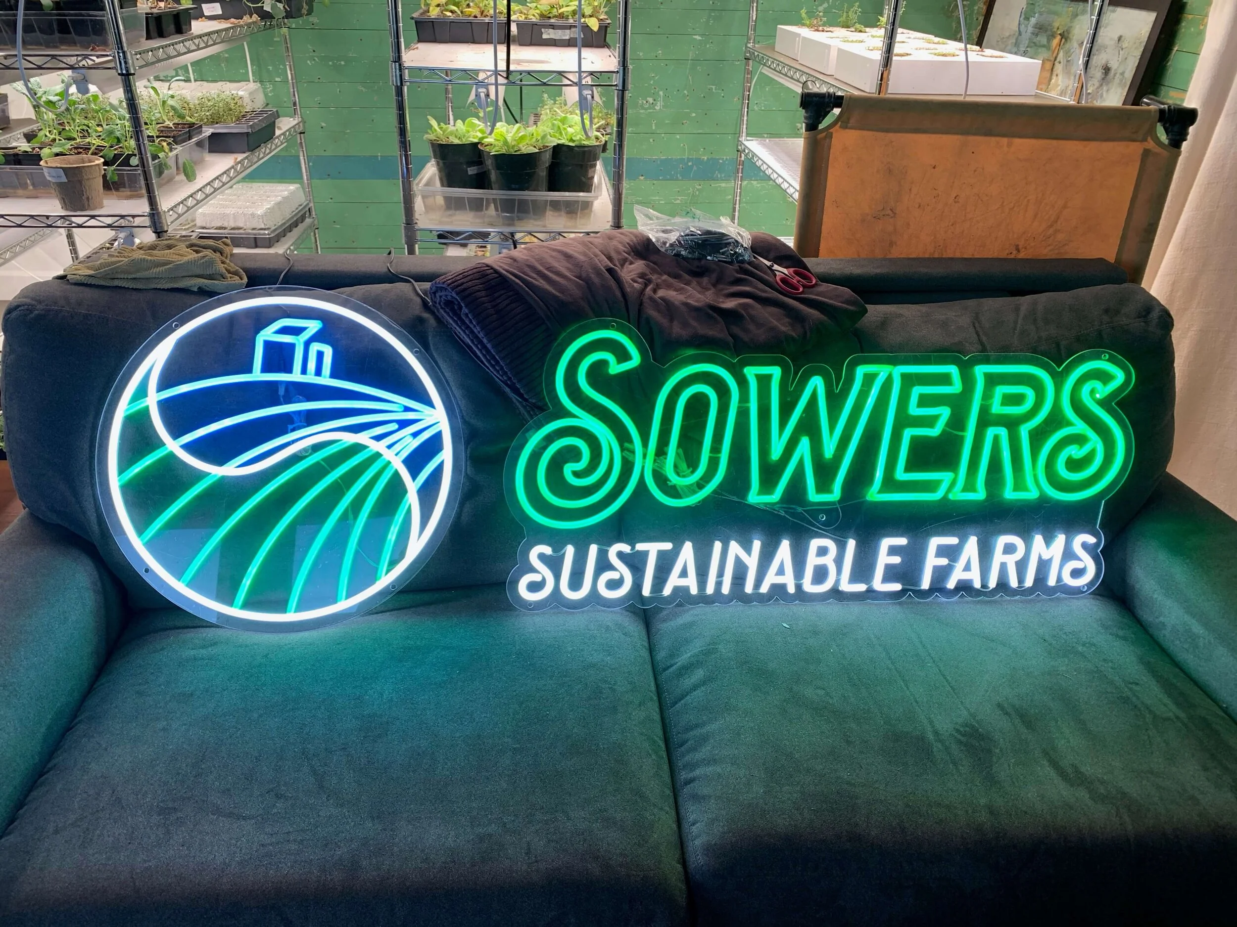
A neon logo sign to be used in the soon-to-be-implemented rolling farmers market on Gertie, the tiny house bus.
The Farmacy sign was needed to start branding the natural health and wellness aspect of the farm offerings.

Branded Apparel
The next branding project we’re working on is Sowers Sustainable Farms branded apparel. We’re still in the process of development. We’re also working on an interactive farm map for their website, designed to educate about rotational grazing, biodiversity, and all the other sustainable processes which go into the Sowers’ daily farm life.
As the Sowers Sustainable Farms brand continues to grow, we will continually be adding to this page. I’m super excited about these upcoming projects: The Farmacy product packaging and designing a vehicle wrap for the rolling farmer’s market bus.


