Brand Identity: Sowers Sustainable Farms
BRAND BOARD
Sowers Sustainable Farms is creating and maintaining a sustainable farm, which restores biodiversity and natural balance. We hope these efforts will result in the expansion of awareness and the formation of a community that will further propagate sustainable practices.
A Branding Board, also called a Mood Board, starts to define the visual elements of the brand. Taking cues from the logo, I start to extrapolate what elements would work within the visual branding.
Color palettes are explored with color theory in mind, evoking the emotions we’d like the brand to convey. Here I utilized a color palette that is bright, colorful, and youthful. I also wanted to explore colors tied to natural elements like land, sky, harvest (maize), dirt/wood, along with a startlingly bright color (coral) and a neutral color (graphite). Colors vibrant enough to really pop next to each other. Iconography, textures and background patterns, design elements, and photography.
With the fonts, the Sowers had mentioned that they wanted to harken back to the days of the old-fashioned general store. Which is how we settled on the logo typeface. I combined this retro type in juxtaposition with more modern and clean typefaces. Plus I included a script typeface for emphasis and personal messages.
The iconography is flat and graphic, with a nod to the logo yin/yang farm symbol. Also to incorporate that modern aesthetic. Very basic representations of farm elements: bee, barn, fruit, vegetables, etc. Fun, simple, hand-drawn framing devices used to give it a whimsical yet homespun personality.
With patterns and backgrounds, I explored topographic map textures along with rough textures you might find on a farm, such as wood grain or eroded metal. The roughness against the clean lines of the iconography and typefaces marries the old with the new. Old-school farming working with the new sustainable sensibility.
With the design elements, I followed the same trajectory of mixing vintage engraved or worn imagery with the more modern, clean design elements. Same hand-drawn borders to be incorporated for a touch of whimsy.
For photography, I opted for wide, expansive visuals. Emotive of the vast Texas countryside. Or utilizing grayscale images with a spot of color for visual focus.
Brand boards can be instrumental in guiding the visual development of a brand. Of course, since the brand will be ever-evolving, it’s good to keep the rules somewhat flexible. And to revisit the branding board every so often to apply updates as the brand continues to grow.

Wedding Branding: Julie & Simon’s Wedding
Brand Board
Julie & Simon are a couple who were planning our wedding, and Julie happened to be the niece of one of my clients. So they reached out to me to help them brand their wedding.
First I interviewed Julie on how she and Simon met. What makes them uniquely a couple. How their personalities meld and how they are different.
I also asked her for motifs she had in mind for her big day:
Wedding event colors or motifs? She sent me links to her own “mood” boards on Pinterest and that helps lead us in the right design direction.
Coastal Farm to Table
Outdoors by the ocean in L.A.
Navy & White w/blush accents
Candles & long wooden benches
Eucalyptus
Not fancy or fussy
Overall feel/mood of the wedding:
Simple but elegant; classic
Family, friends, love, community
Visual themes:
California
The Ocean
Vegetable garden; fruits & vegetables
3 adjectives:
Coastal
Farm to table
Love & commitment


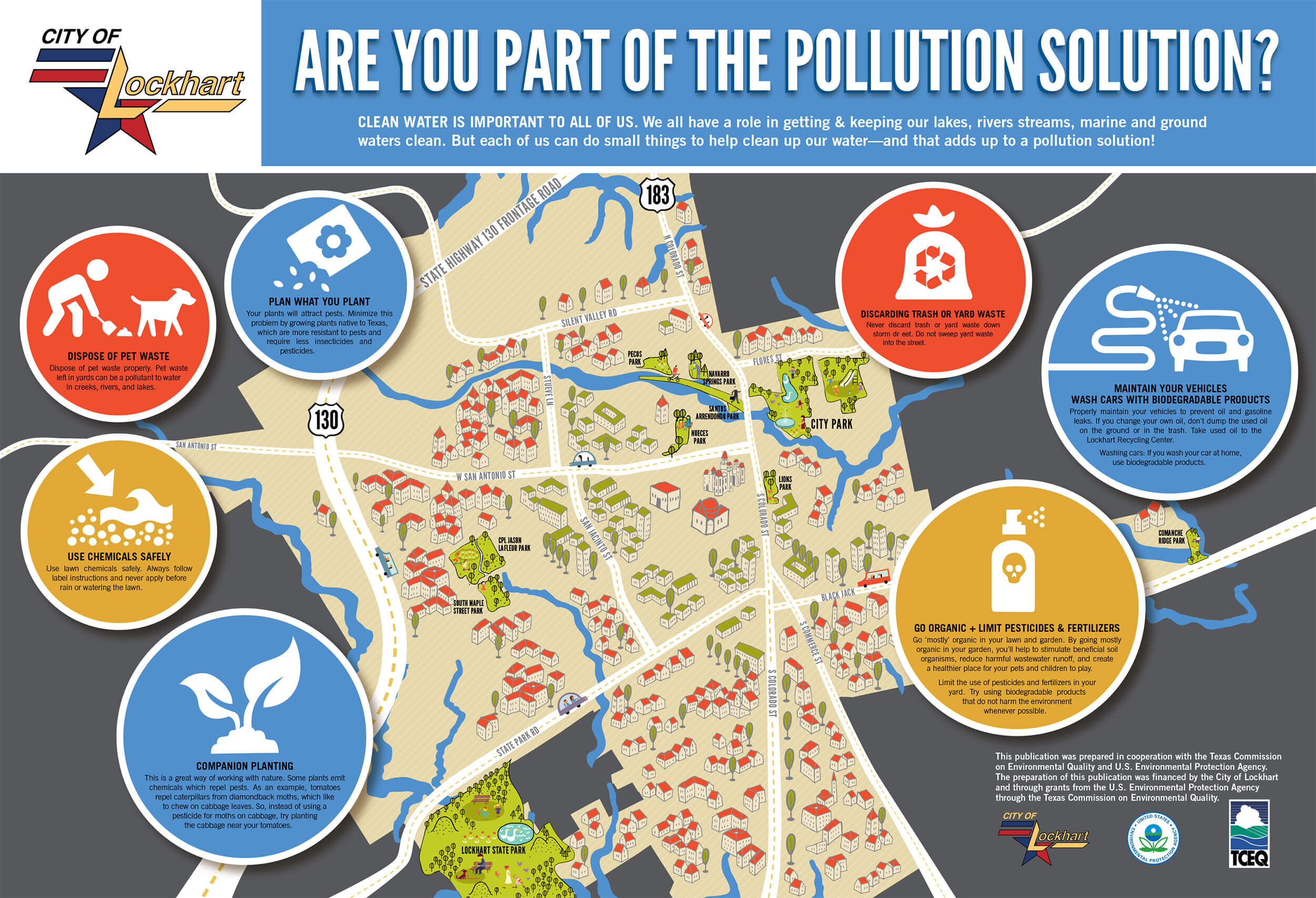
City of Lockhart Ecology Map
mood board
Working with the City of Lockhart on a big project, like a map to go in all their city parks explaining the necessity of ecological practices, was the perfect opportunity to explore mood boards.
That way we could collaborate on typography, colors, iconography, and general look and feel before ever starting design.
The resulting map is featured below.


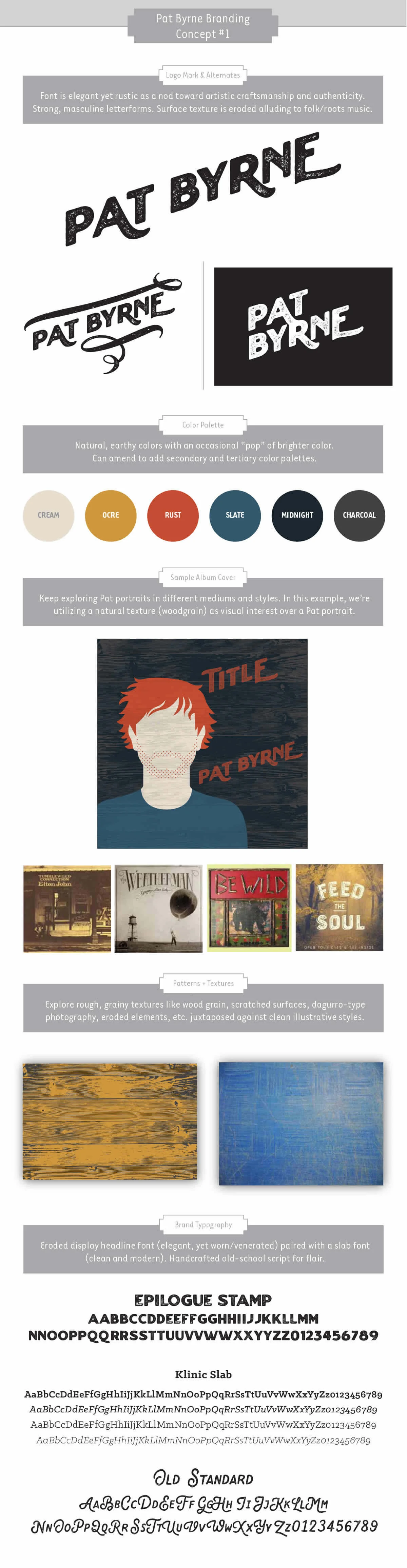
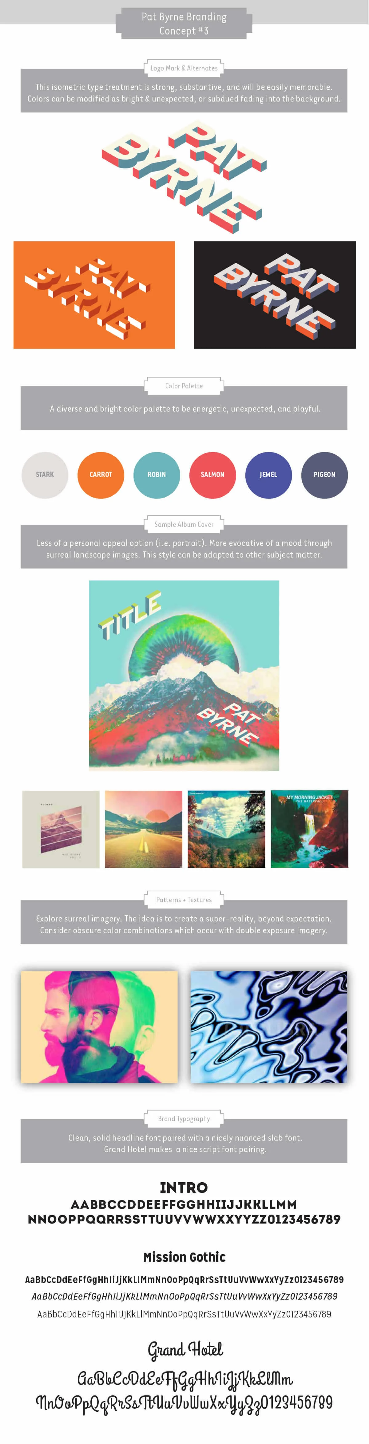
Musician Branding & Identity: Pat Byrne
brand board
Pat Byrne is an Austin-based soulful, singer/songwriter from Ireland.
With this project, I learned a valuable lesson. Sometimes projects don’t turn out as you planned. With all the best of intentions, I made some mistakes along with way. But you stumble, learn what you can from it, and move on.
Initially, I thought to explore mood boards on Pinterest first. No design needed, just exploring different design genres which would relate to Pat Byrne as an artist. But I got overly ambitious and put the cart before the horse. Instead of agreeing on mood boards beforehand, I poured myself into an entire brand exercise with each logo design. Talk about putting in the extra work! But I was excited, inspired, and decided to put in the extra effort.
So instead of generic mood concepts with these boards, I presented Pat and his management team, with the whole kit and kaboodle: entire branding boards with each design. I explored not only logo design concepts, but album cover artwork, design styles, color palettes, textures, patterns, photographic imagery, and brand typography.
Unfortunately, these designs missed the mark. Even though I explored the second round of new logo designs at no cost, the damage was done. I had lost their confidence, and they decided ultimately to go in a different direction. It stung, but I learned a valuable lesson. Don’t cut time-savings corners to impress with over delivery. Live and learn, my friends.