Media Kit:
people fund
PeopleFund creates economic opportunity and financial stability for underserved people by providing access to capital, education, and resources to build healthy small businesses.
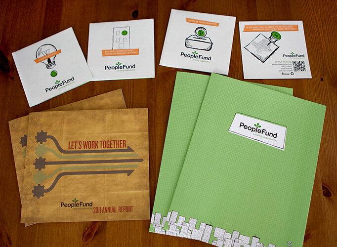
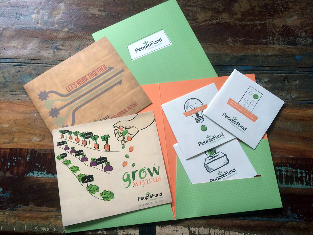
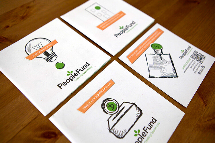
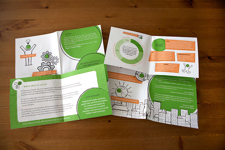
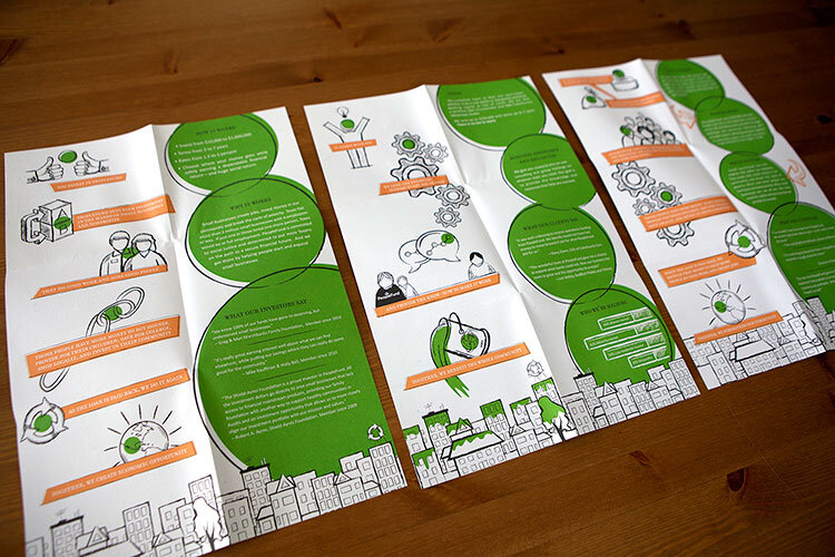
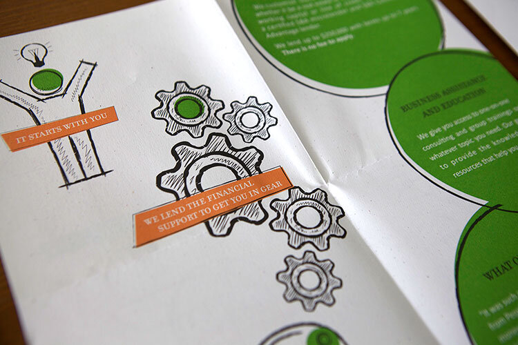
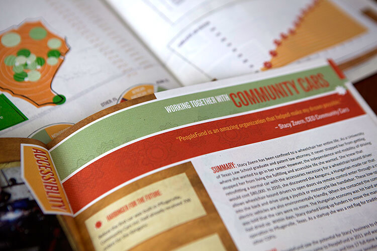
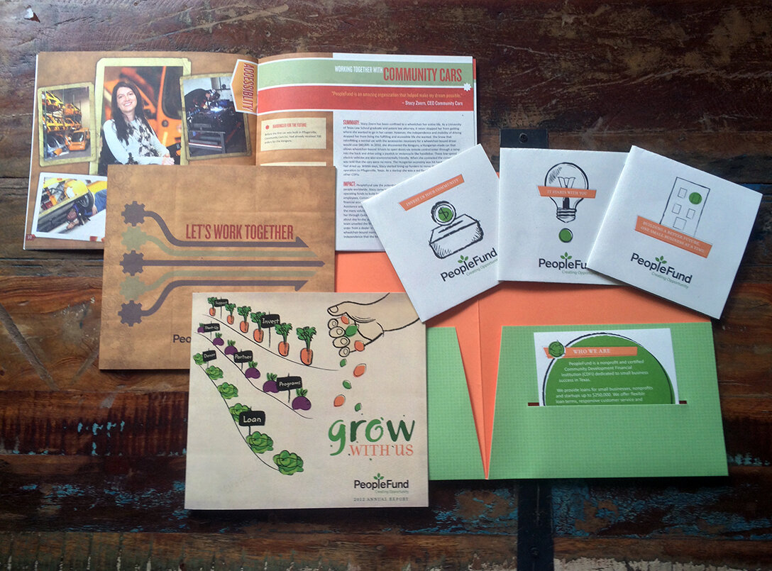
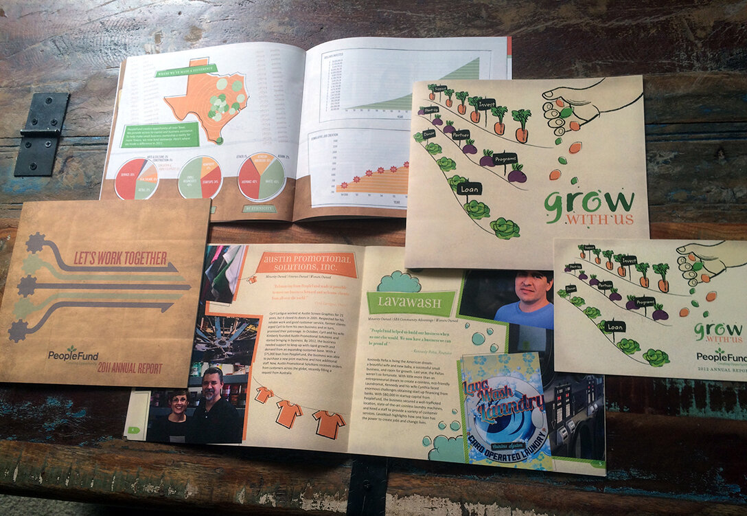
We initiated PeopleFund’s branding with a pocket folder/media kit. This was a modular solution, with folded brochures slipping into slots on the pocket. Each brochure was targeted to one of three audiences: donors, investors, and loans/loan info. We utilized grainy, recycled stock and hand-drawn illustrations to emphasize the grass roots nature of PeopleFund’s community-growth oriented service.
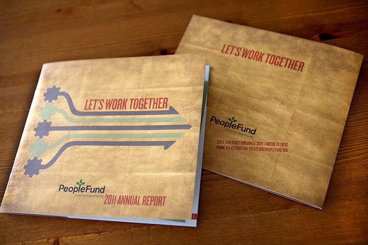
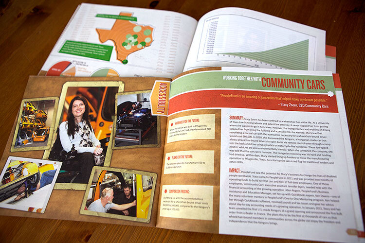
Shown is the media kit folder with the four inserts, and we carried that roughened design theme through the annual report. In following years, we continued to explore the hand-drawn elements in subsequent annual reports and PeopleFund’s website.

Identity Development + Branding Campaign:
single jingles
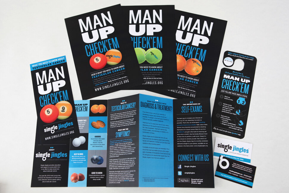
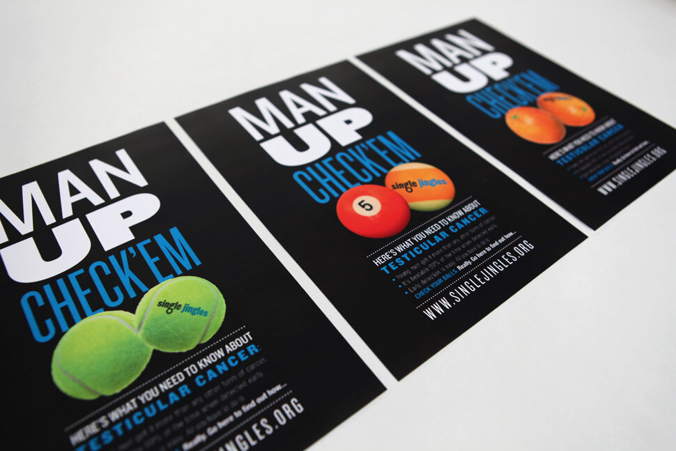
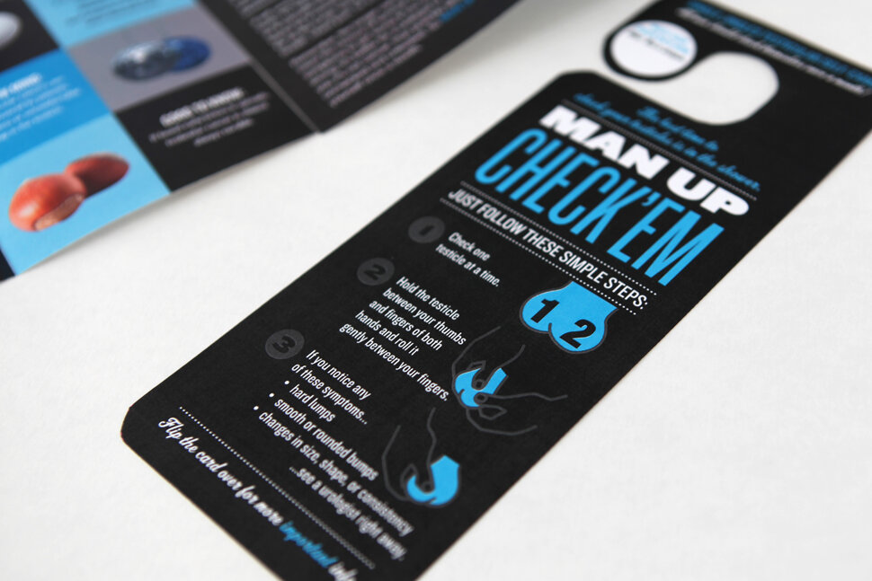
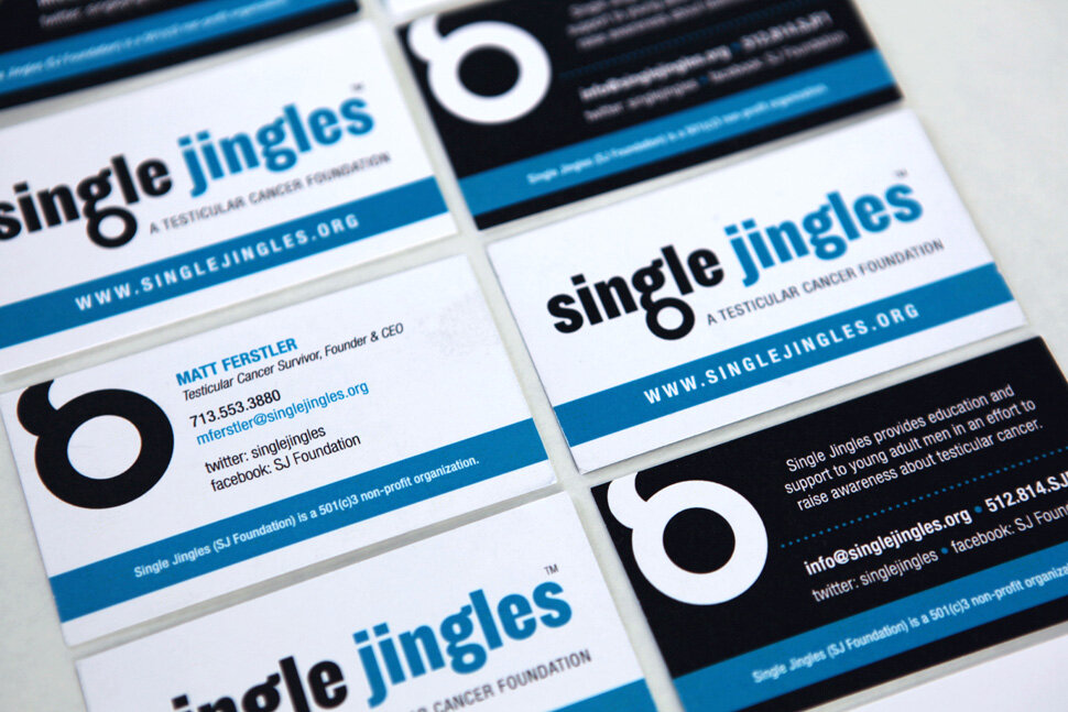
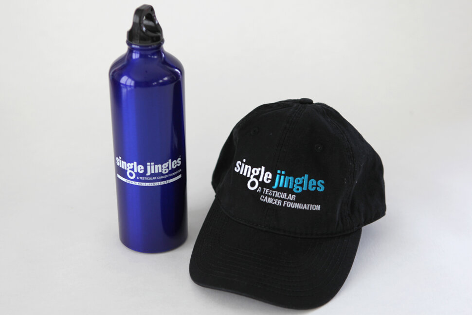
Single Jingles (now Testicular Cancer Foundation): Testicular Cancer Foundation provides education and support to young men to raise awareness about testicular cancer, the most commonly diagnosed cancer among males ages 15 – 34. TCF supports families of testicular cancer patients and shares its resources with the medical and healthcare communities, schools and various young men’s groups.
We initiated branding with the logo, the expanded to stationery + business cards. Cheeky messaging (“MAN UP: CHECK ‘EM), which is inherently in the brand name, was applied to awareness campaign posters, a brochure, a waterproof shower hanger (with instructions for self care exams), and promotional items. Cohesive branding is our specialty. Making all your elements work together cohesively to form a unified brand voice.
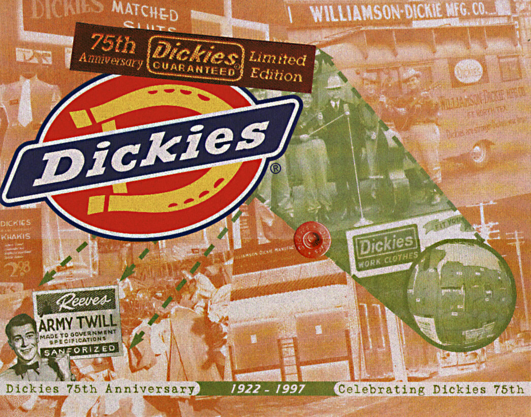
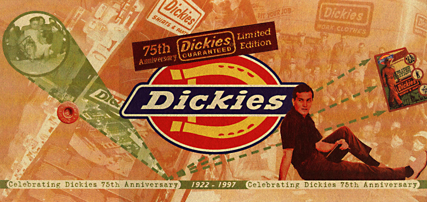
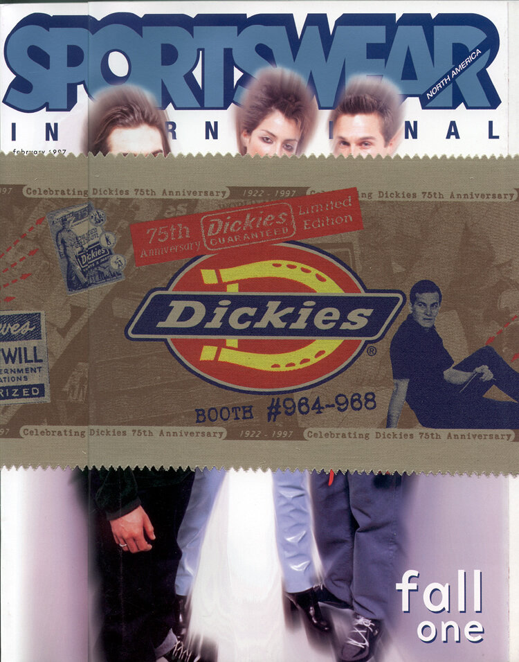
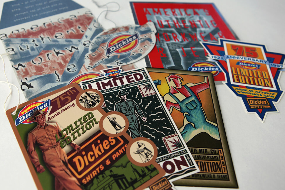
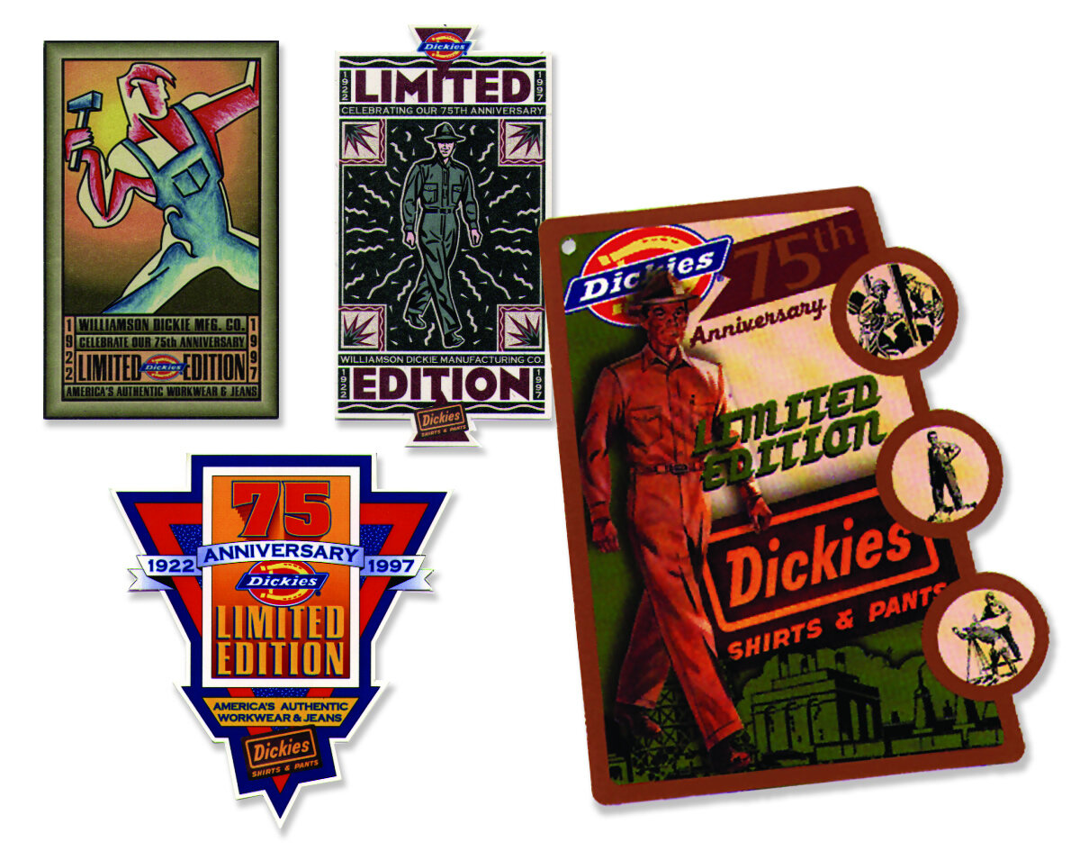
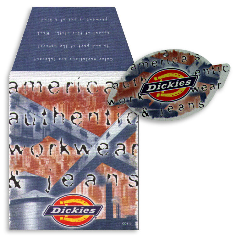
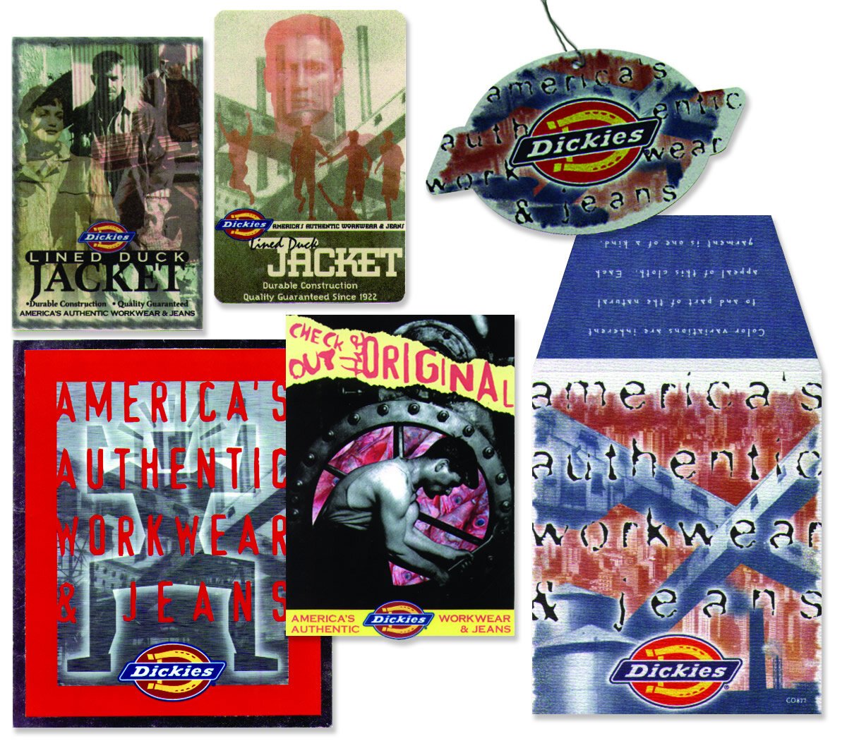
75th Anniversary Branding Campaign:
dickies
Williamson-Dickie Mfg. Co. (aka Dickies) is an apparel manufacturing company began a denim bib overall company selling workwear to farm and ranch hands around the Southwest. Today, Dickies is a global brand found in more than 100 countries designing, manufacturing and selling workwear to the automotive, hospitality, construction and medical industries.
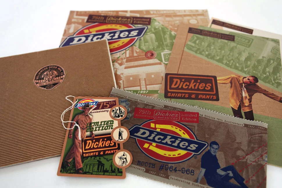
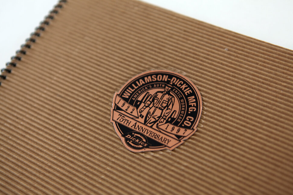
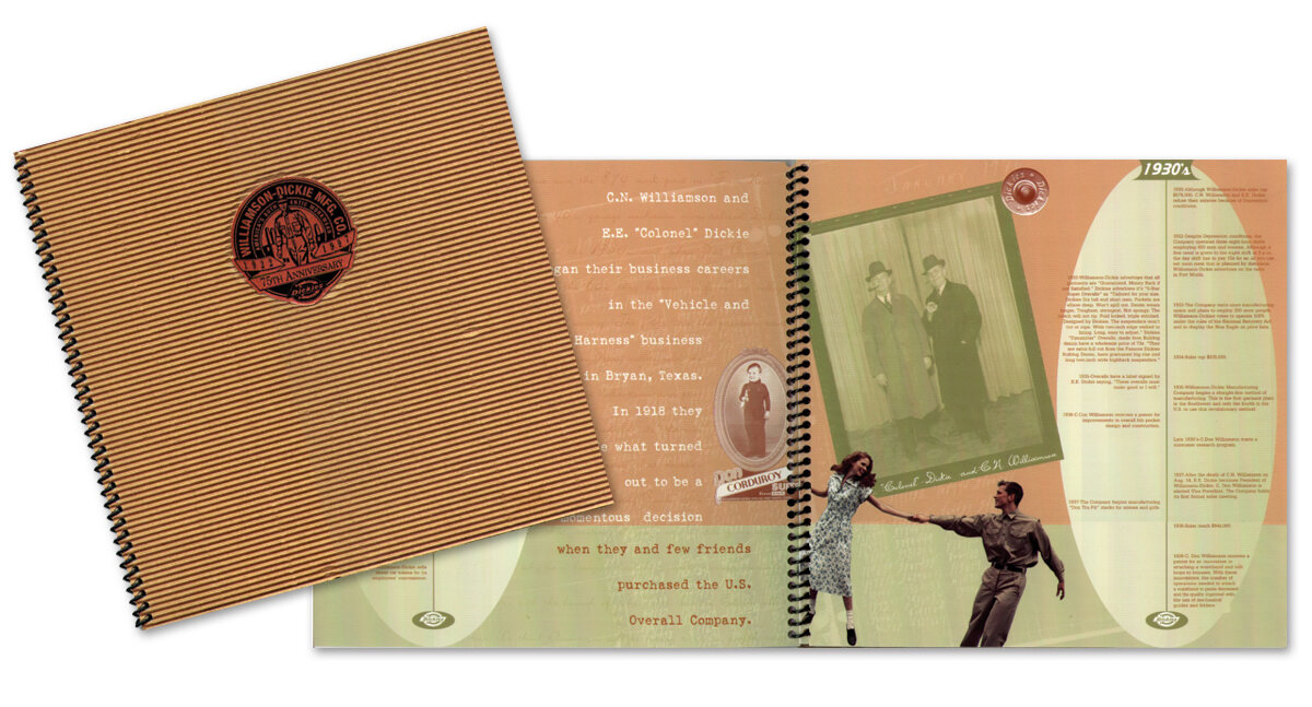
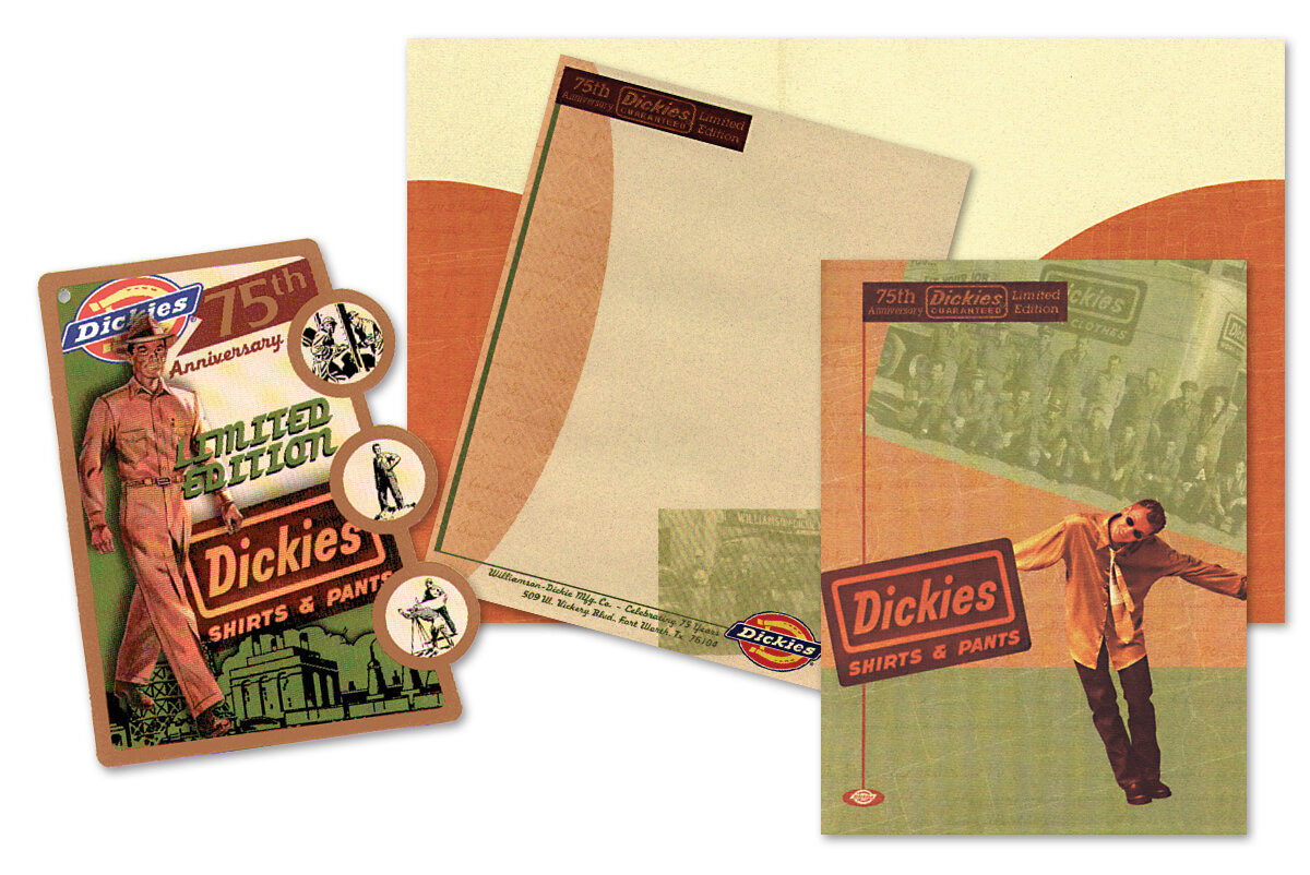
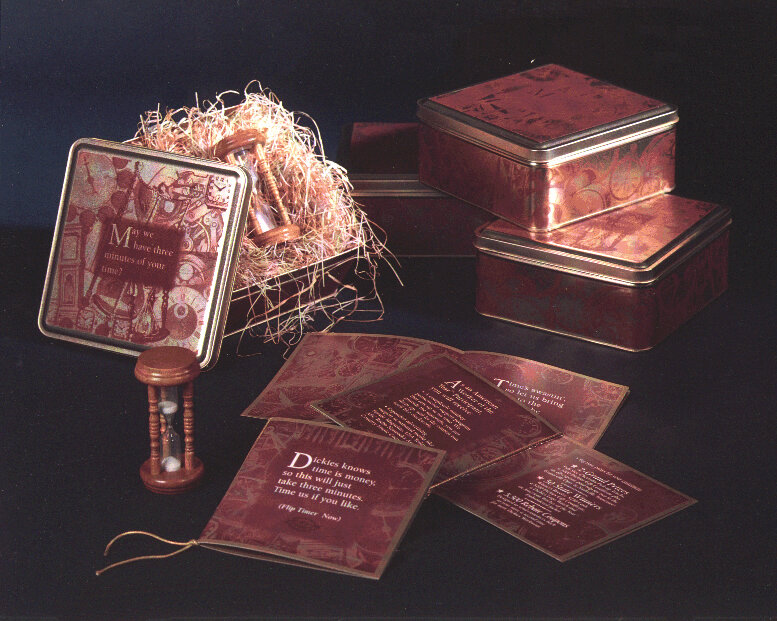
Yes, this is old work, but I’m quite proud of the branding I created for Dickie’s 75th Anniversary. I was provided access to their archives and created retro fashion hangtags (packaging), point of sale collateral, a salesperson promotion with a time theme, a media kit with pocket folder and letterhead, plus I got to research and design their very first Annual Report. Not exactly an AR in the standard sense, but more of a company promotional piece, since they are (still) a privately held company.
I researched and incorporated old photos, company milestones, old text correspondence, old advertising imagery, and even 1930s garment patterns. We silkscreened belly bands printed on Dickies khaki material to be shrink wrapped around fashion magazines. They were so pleased with the retro hang tag packaging, they set me to work on packaging for the youth market and explored many different approaches. Ultimately an industrial look was chosen, which is quite fitting considering they are an industrial work wear brand.