Kohala Center, PeopleFund, + Habitat for Humanity:
annual reports
The Kohala Center Annual Report (one cover followed by two spreads): “From The Kohala Center’s very beginnings, we have said that ‘we believe in a state of pono, in which individuals realize their potential, contributing their very best to one another, to the community, and to the ‘āina, the land itself, in exchange for a meaningful and happy life.’ The values of productive and responsible interdependence are embedded in this vision. Our volunteers, our partners, and our staff personify these values every single day in the way that we together serve island communities and island environments.”
PeopleFund Annual Reports (6 years - one cover followed by one spread): PeopleFund places a high priority on strong fiscal stewardship. We are careful managers of the funds entrusted to us and require quarterly reporting from our clients and from each of our programs.
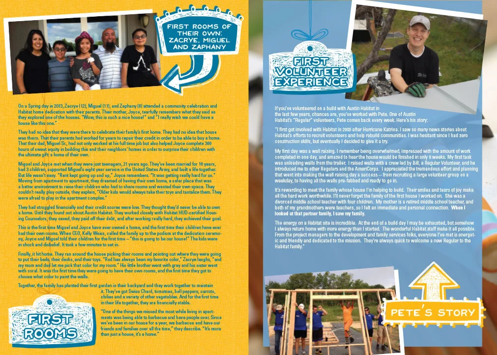
Austin Habitat for Humanity Annual Report (one cover followed by two spreads): Austin Habitat for Humanity’s mortgage recycling program is a unique economic model designed to promote financial self-sufficiency. Through the support of generous donors and volunteer labor, Austin Habitat is able to offer families affordable mortgages, which homeowners pay off over 30 years. Each monthly payment is recycled into the operating budget to help finance future homes. The Austin Habitat for Humanity ReStore continues to provide a sustainable source of revenue for our mission. The ReStore accepts donations of gently used construction and remodeling material for resale and reuse in the community.


Identity Development + Branding Campaign:
single jingles
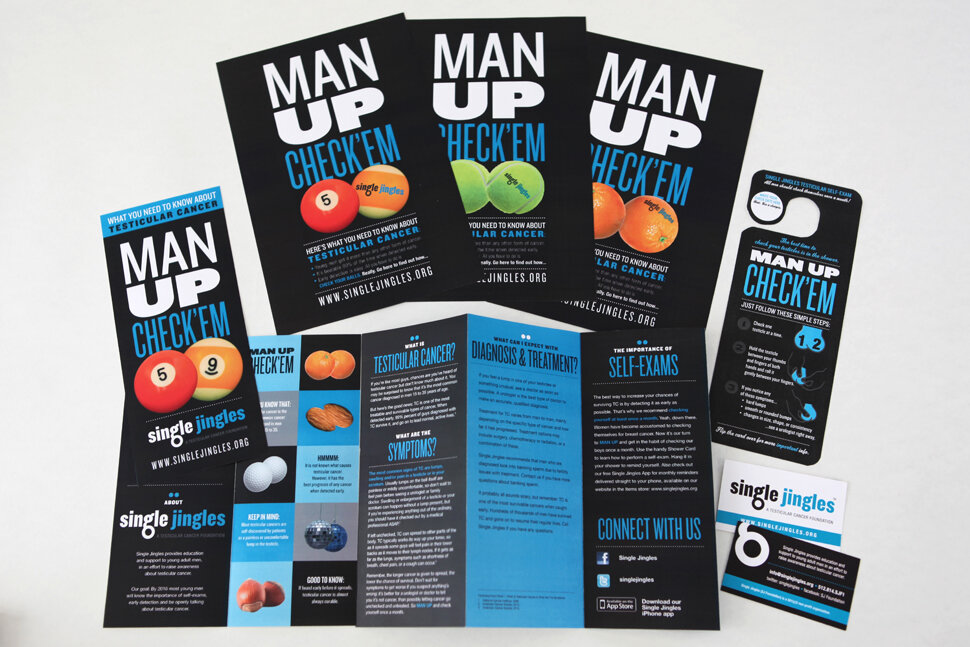
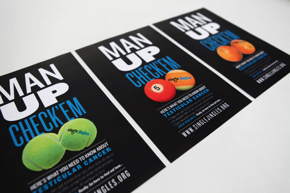
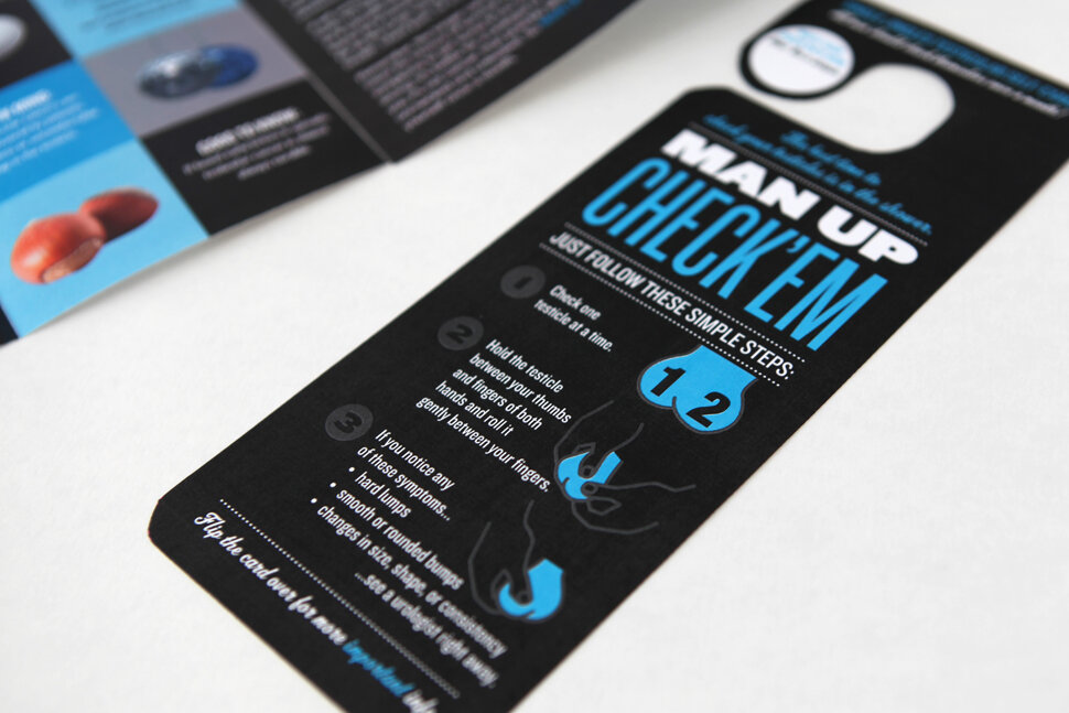
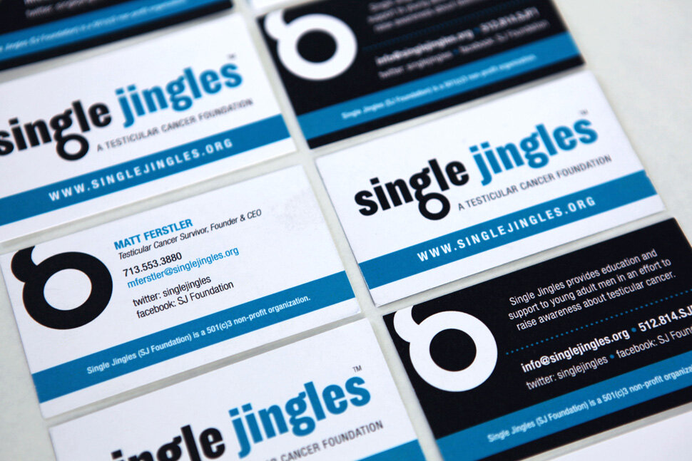
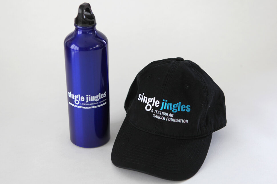
Single Jingles (now Testicular Cancer Foundation): Testicular Cancer Foundation provides education and support to young men to raise awareness about testicular cancer, the most commonly diagnosed cancer among males ages 15 – 34. TCF supports families of testicular cancer patients and shares its resources with the medical and healthcare communities, schools and various young men’s groups.
We initiated branding with the logo, the expanded to stationery + business cards. Cheeky messaging (“MAN UP: CHECK ‘EM), which is inherently in the brand name, was applied to awareness campaign posters, a brochure, a waterproof shower hanger (with instructions for self care exams), and promotional items. Cohesive branding is our specialty. Making all your elements work together cohesively to form a unified brand voice.
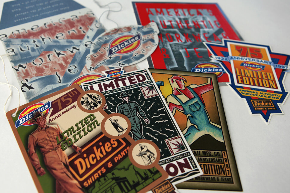
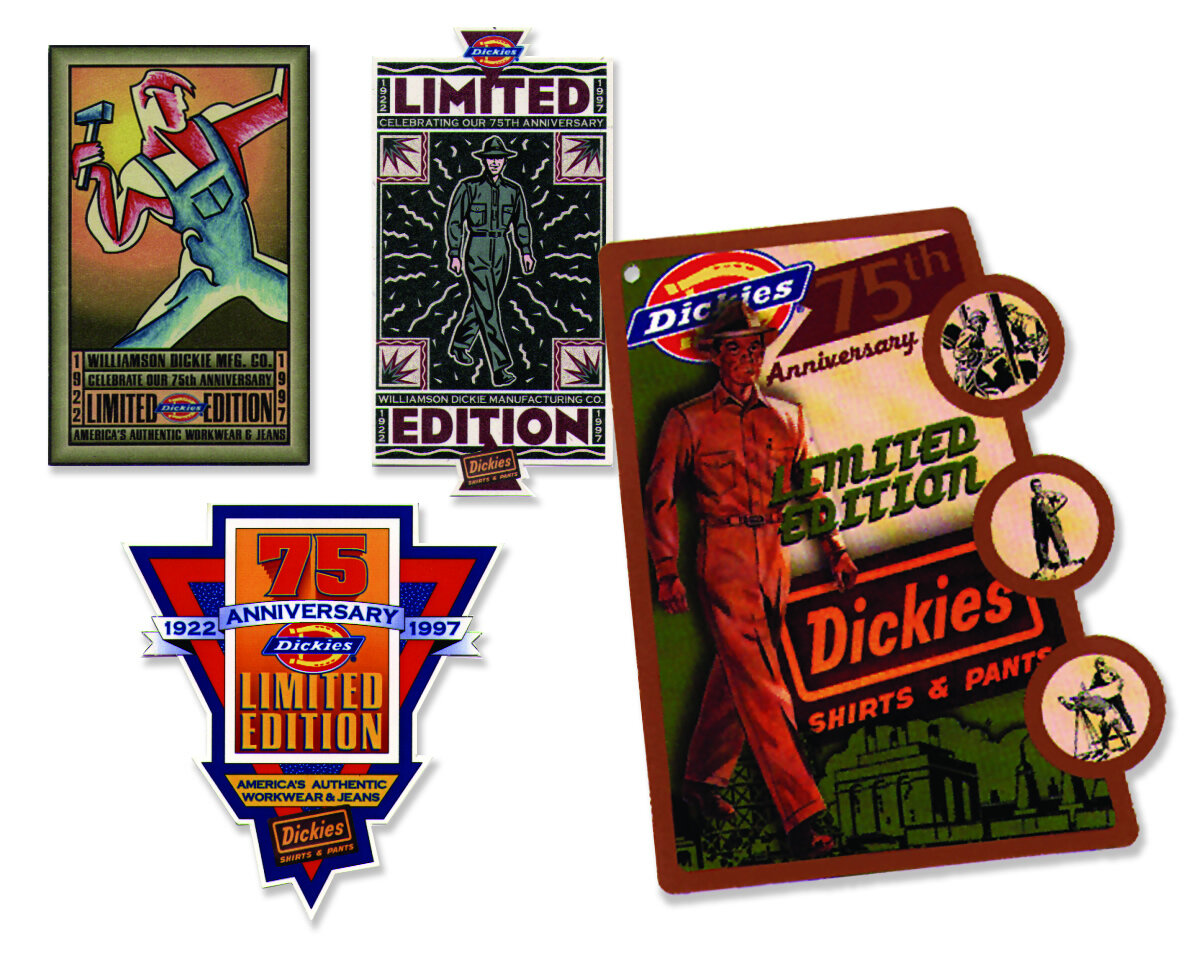
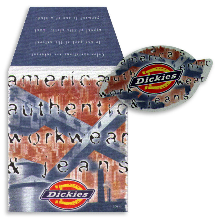
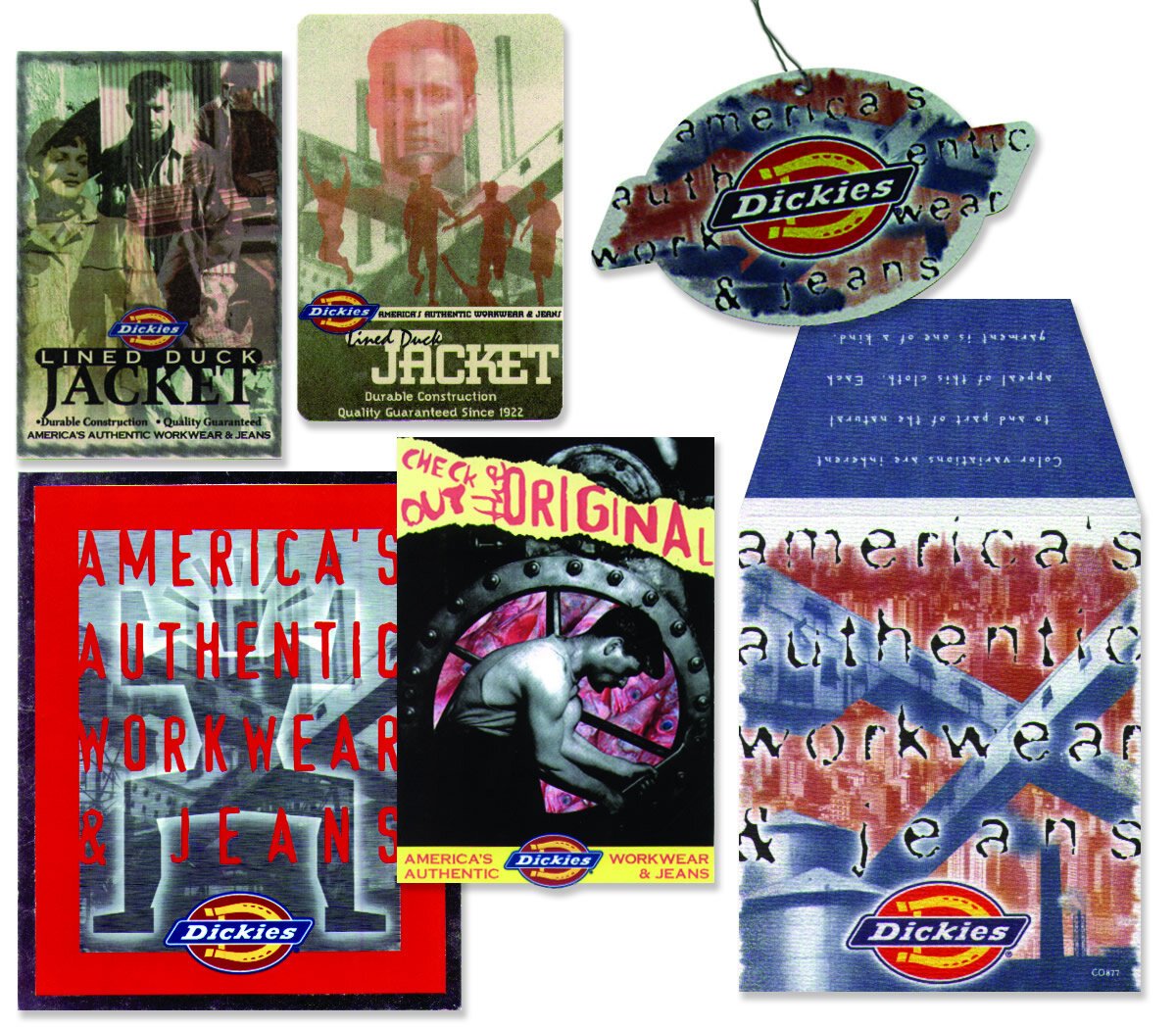
75th Anniversary Branding Campaign:
dickies
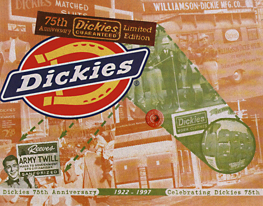
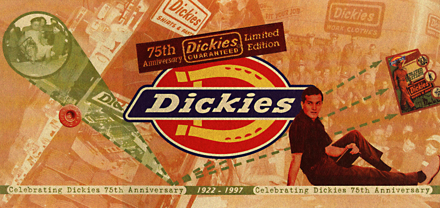
Williamson-Dickie Mfg. Co. (aka Dickies) is an apparel manufacturing company began a denim bib overall company selling workwear to farm and ranch hands around the Southwest. Today, Dickies is a global brand found in more than 100 countries designing, manufacturing and selling workwear to the automotive, hospitality, construction and medical industries.
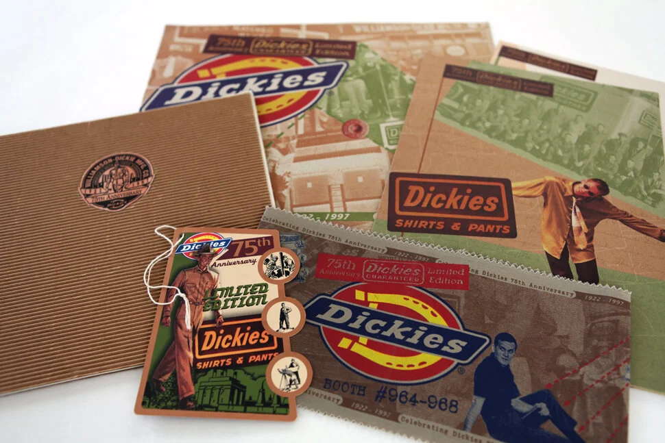
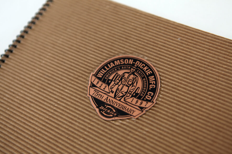
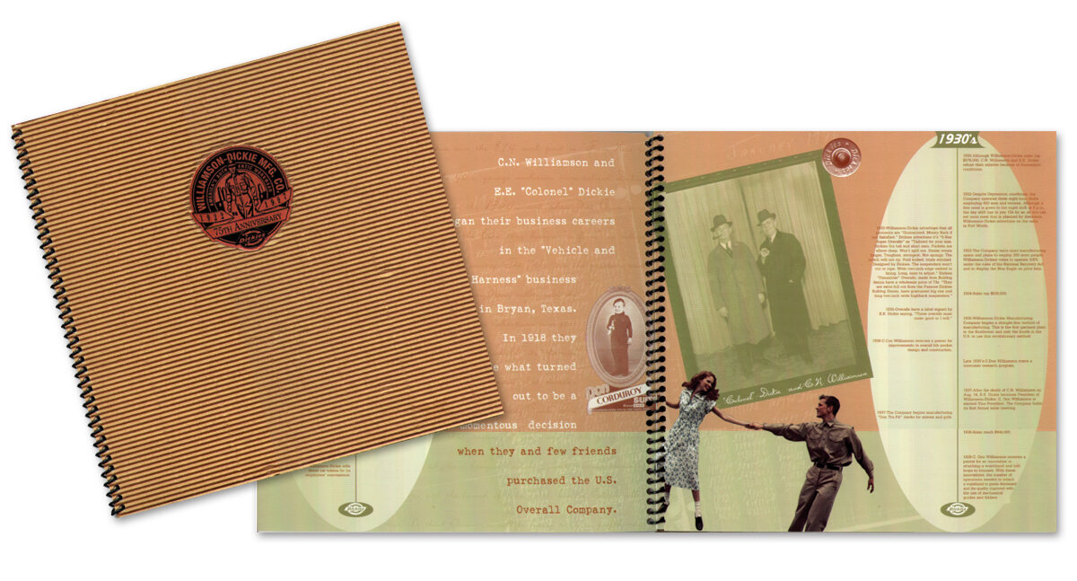
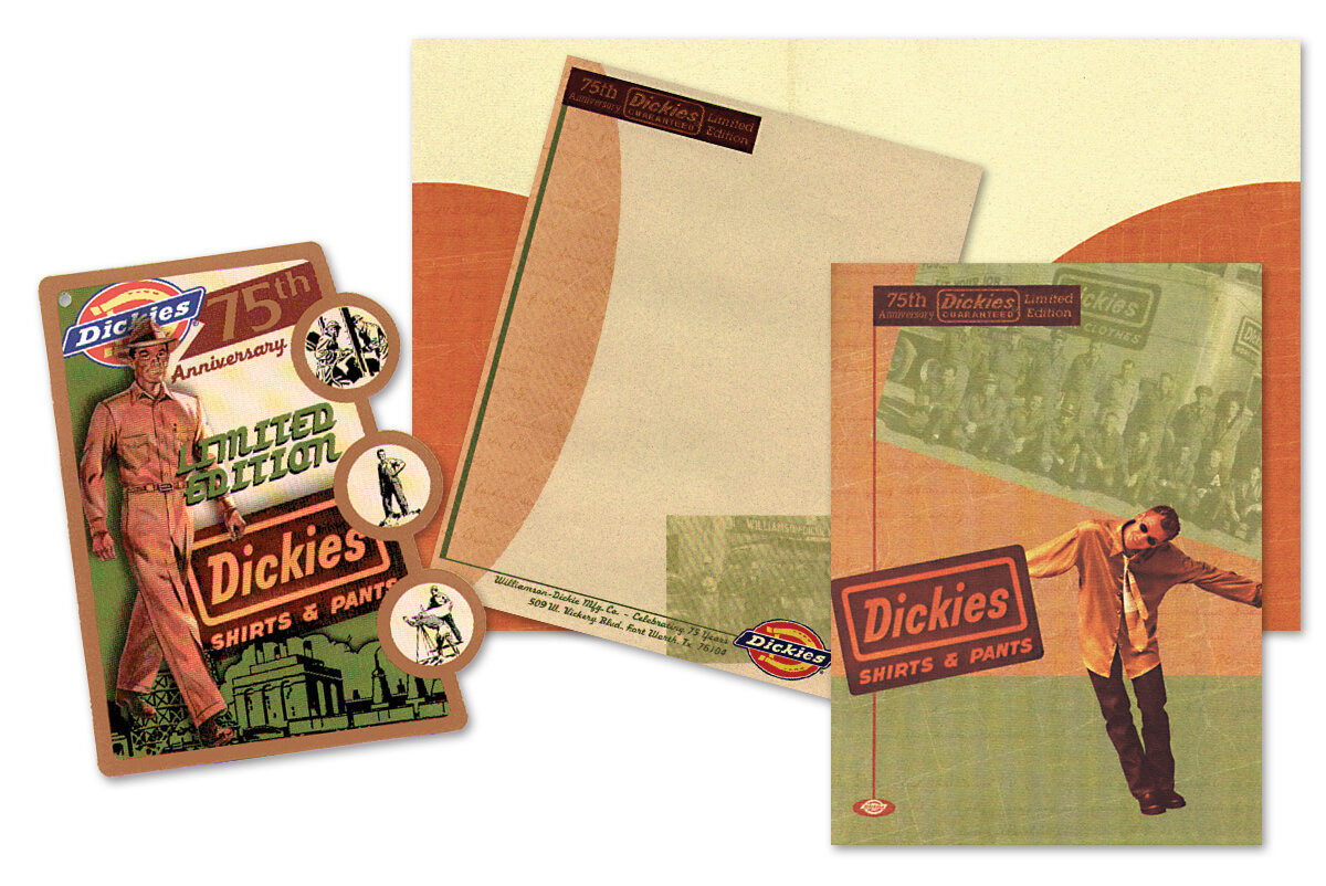
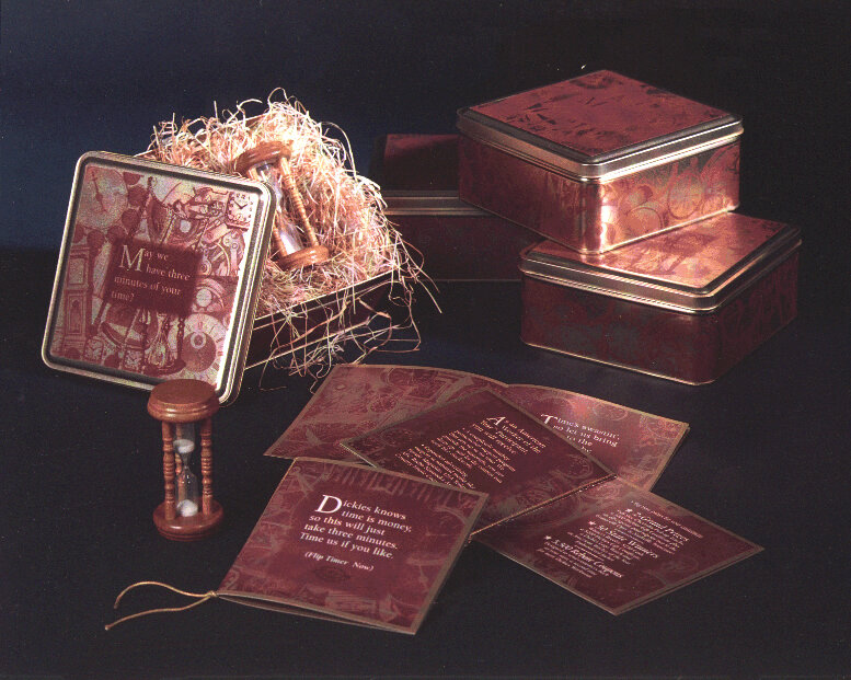
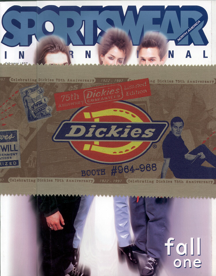
Yes, this is old work, but I’m quite proud of the branding I created for Dickie’s 75th Anniversary. I was provided access to their archives and created retro fashion hangtags (packaging), point of sale collateral, a salesperson promotion with a time theme, a media kit with pocket folder and letterhead, plus I got to research and design their very first Annual Report. Not exactly an AR in the standard sense, but more of a company promotional piece, since they are (still) a privately held company.
I researched and incorporated old photos, company milestones, old text correspondence, old advertising imagery, and even 1930s garment patterns. We silkscreened belly bands printed on Dickies khaki material to be shrink wrapped around fashion magazines. They were so pleased with the retro hang tag packaging, they set me to work on packaging for the youth market and explored many different approaches. Ultimately an industrial look was chosen, which is quite fitting considering they are an industrial work wear brand.